Health in New York and Chicago by Subway and L-Stops: A Pictorial Essay.
 In a previous Dean’s Note, I showed how the health of residents in Boston varies, sometimes dramatically, across areas that are fairly close to one another, despite world-class medical facilities in the vicinity of both healthy and unhealthy neighborhoods. In response to the Boston T-stops pictorial essay, many have asked whether Boston is “different”—whether observed health inequalities across areas in our large US city hold true in other cities, and whether the analogy of health inequalities by T-stops extends to these other cities as well. In response, we have mapped the health of residents of New York and Chicago onto their relevant public transportation, the subway and the L, respectively. We find, perhaps not surprisingly, much the same picture as we found in Boston: substantial inter-area heterogeneity across many health indicators, frequently mapping onto subway/L-stops that are close to one another, and differences that are present despite the proximal presence of world-class medical facilities.
Let’s start with New York. New York is, of course, a much bigger and very different city from Boston. There is also a substantial literature about health disparities in New York, so the observations made here were entirely to be expected. As we did with Boston, we present here a few pictures that are representative of the larger picture of health inequalities across the city.
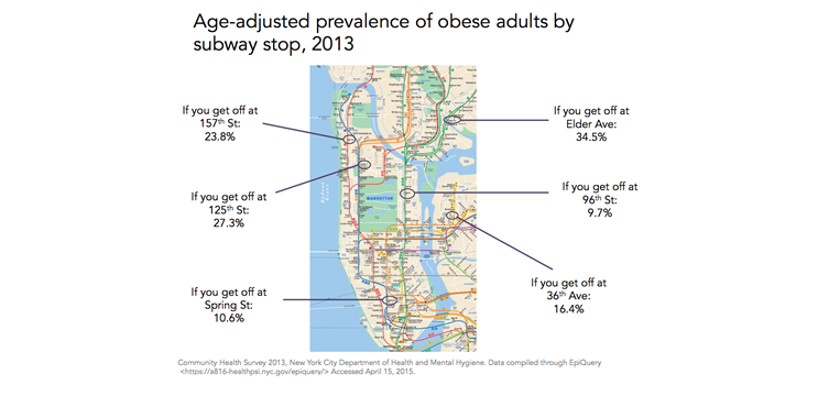
Starting with obesity, we can see that the prevalence of obese adults at the Elder Avenue stop in the Bronx is more than three and a half times the prevalence at 96th Street on the Upper East Side.
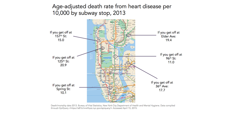
We see similar patterns for heart disease, with the highest rates in the Bronx and the lowest, by a factor of two, on the Upper East Side and Greenwich Village.
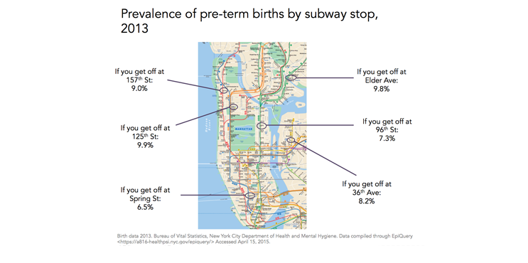
For a less extreme example, we show the prevalence of pre-term births below. Again, the highest proportions are seen at 157th Street in Washington Heights, 125th Street in Harlem, and Elder Avenue. There were more than 50 percent more pre-term births in 2013 in Harlem than in Greenwich Village at Spring Street or at 96th Street.
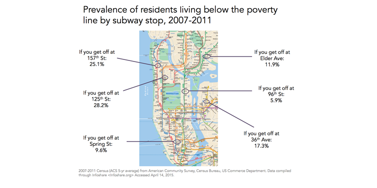
As in Boston, the patterns of geographic health inequalities map quite consistently with patterns of foundational drivers of population health such as poverty, which, as shown in the next map, is highest at the 157th Street, 125th Street, and Elder Avenue subway stops.
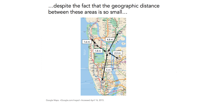
What makes these differences striking is that they are in neighborhoods that are very close to each other; many of these subway stops are just two to five miles apart.
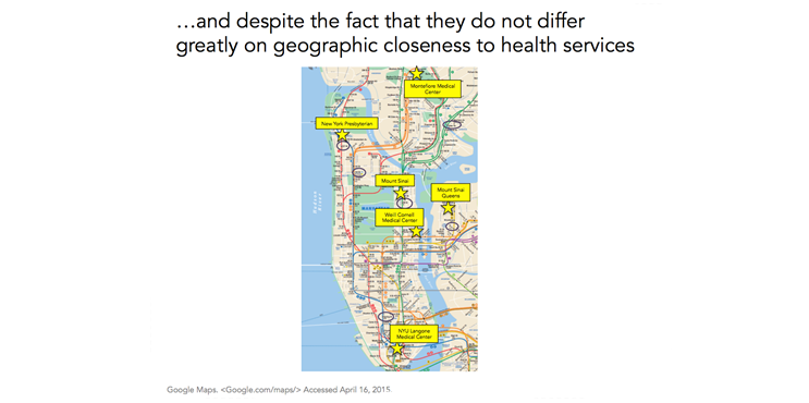
And similar to Boston, there are world-class medical facilities right down the street from many of these stops. The proximity of medical facilities to remarkable health heterogeneity clearly raises questions about proper access to health care in these facilities. However, it somewhat strains credulity that these differences reflect only, or even largely, differences in access to health care. Rather, they call into question the role played by foundational drivers of these differences, and the centrality of context as a driver of population health.
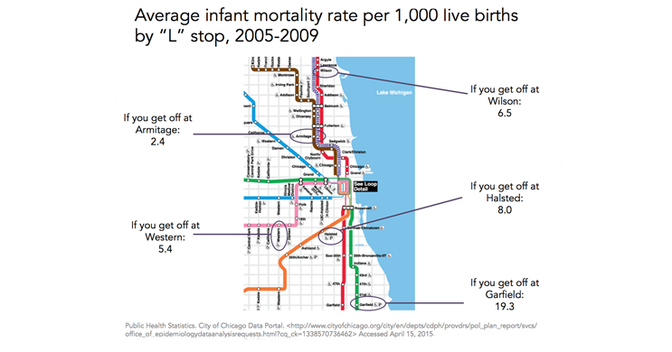
Chicago is less compact than either Boston or New York. There has also been quite a bit of academic literature discussing health disparities in Chicago. Framing our pictorial around the “L” (Chicago Transit Authority) stops, we start with the figure below, showing that the infant mortality rate at Garfield in Washington Park is eight times greater than the rate at the Armitage stop in Lincoln Park, and almost four times greater than that at the Western stop on the Lower West Side.
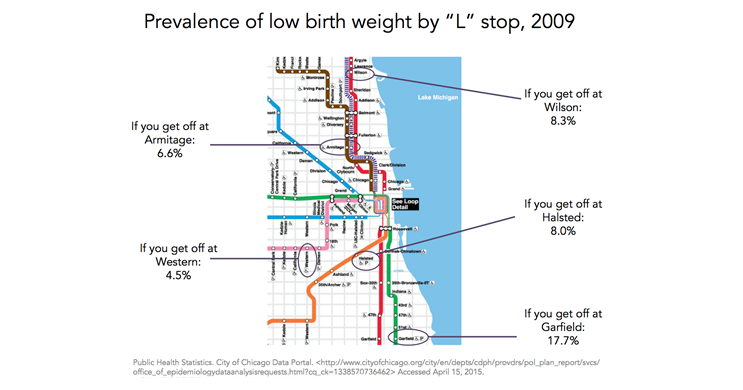
Similarly, when looking at low birth weight, we see that the area around Garfield had more than twice the prevalence of any of the other stops shown in 2009.
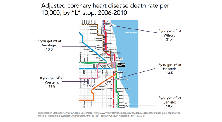
Coronary heart disease death rates per 10,000 in the figure below range from 11.8 to 21.4, with the Wilson stop seeing almost twice the rate as the Western stop and Armitage and Halsted in the middle.
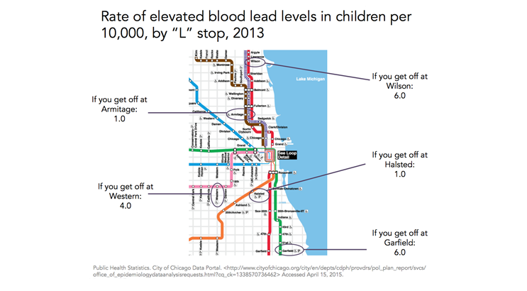
Lastly, when examining rates of elevated blood-lead levels in children, we see rates at Garfield and Wilson that are six times higher than those at Halsted and Armitage, with Western in the middle at 4 per 10,000 children.
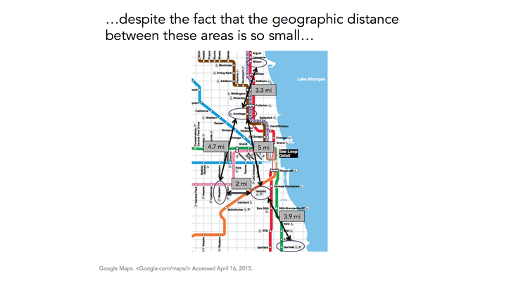
While Chicago sprawls more geographically than do either Boston or New York, we still see that some of these stops are only a few miles apart.
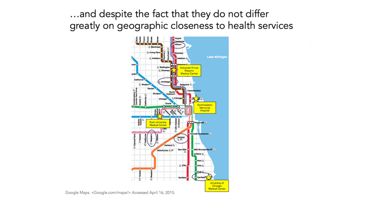
And, consistent with the full picture being shown here, we again see that these areas do not differ much in terms of their distance to medical facilities. In fact, Garfield, which we consistently find to be worse off on health indicators, is right across the park from the University of Chicago Medical Center.
We have here extended the geographic metaphor we introduced in the previous Dean’s Note about Boston. It has since been brought to my attention that others have deployed similar metaphors to consider health differentials across other cities, and some have shown similar observations in New York and Chicago. These pictorials tell “stories.” But they are stories that importantly characterize a very real, contemporary, American urban experience. As cities grow, concentrate resources, change, and improve for the better, they remain characterized by tremendous heterogeneity in health indicators across populations living just a few miles—and one or two subway stops—apart. I have previously written about how access to health resources is one of the characteristics of cities that can lead to health disparities. However, these health inequalities exist despite the presence of world-class medical facilities spread out relatively evenly among areas with high and low health indicators. This all points to the inextricable and ineluctable link between living conditions and the health of local populations, pointing a way forward for public health, and for the essential role public health must play if we are to improve health for all.
We will not extend this T-stop/subway/L-stop metaphor further (i.e. no more sequels!), but I would welcome reading others who put forward metaphors that help us better understand health domestically and globally, and that can contribute to our evolving health conversation.
I hope everyone has a terrific week. Until next week.
Warm regards,
Sandro
Sandro Galea, MD, DrPH
Dean and Professor, Boston University School of Public Health
@sandrogalea
Acknowledgement: I would like to acknowledge the help of Laura Sampson with the creation of the figures in this Dean’s Note and its prequel.
Previous Dean’s Notes are archived at: https://www.bu.edu/sph/category/news/deans-notes/