news
Marking Time: Art in the Age of Mass Incarceration
Nicole R. Fleetwood
Marking Time: Art in the Age of Mass Incarceration
Cambridge, MA: Harvard University Press, 2020. 352 pp.; 95 color ills.
$39.95
9780674919228
by Michael Rangel
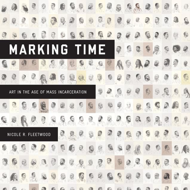
Mass incarceration impacts the lives of Black and Brown communities across the United States at disproportionate and irregular rates. Rarely are those affected given the space or time to tell their stories in relational, exploratory, and creative ways. Nicole Fleetwood’s book, Marking Time: Art in the Age of Mass Incarceration, is based on extensive research and interviews with currently and formerly incarcerated artists and their loved ones, as well as activists and prison staff. It is also drawn from her own family experiences with the penal system, a system that largely imprisons marginalized people. This important text explores the radical potentiality of creating art in insufferable conditions and uncovers the art-making possibilities, imaginaries, and humanity of these incarcerated artists. As a curator, writer, and professor of American studies and art history at Rutgers University, New Brunswick, Fleetwood contests the dominant narrative around aesthetics and the visual representation of those imprisoned. Throughout Marking Time, art serves as a radical practice of freedom and justice within the carceral state.
With more than two million people currently imprisoned in the United States, art practices in prisons exist through complexities of deprivation, abuse, and survival. Fleetwood discusses how the culture and robust nature of art-making inside US prisons can very much act as a means of resisting the isolation, degradation, and dehumanization produced by prison settings. In describing incarcerated artists’ practices and methods, Fleetwood defines “carceral aesthetics” as the visual production of art that emerges from the conditions of the carceral state. It is a way of envisioning and crafting art that reflects the inhumanity of imprisonment. Under conditions of relational practices and “un/freedom,” this carceral aesthetic involves three concepts that Fleetwood explores throughout the book: “penal time,” “penal space,” and “penal matter.” These terms are used to frame how incarceration influences the materials, production, and processes deployed to make art. Within carceral aesthetics, artworks are formations of freedom and unfreedom created to serve as sites for imagination and temporal extraction from regulation, while providing viewers with insights into captivity.
In particular, Mark Loughney’s series Pyrrhic Defeat: A Visual Study of Mass Incarceration (2014), comprised of nearly five hundred pencil-on-paper portraits, and Tameca Cole’s Locked in a Dark Calm (2016), a composite portrait of graphite and collages, visualize the art practices and methods used to survive the constraints of penal time and space, while using penal subject matter. Fleetwood reflects on her own experiences of visits to her cousins while they were serving time in prison and provides her own family’s portraits within the text. Fleetwood, Loughney, and Cole’s portraits embody the connections that occur under unimaginable conditions and envision an archive of carcerality that resists the exploitation and dehumanization of those imprisoned.
Art made in prisons reimagines new aesthetic possibilities and restores what it means to be human. Marking Time is a transformative publication that considers the implications of incarceration and the carceral state. But the power here lies in the possibilities of freedom, justice, and life through the creation of each of these artists' works.
____________________
Michael Rangel
Michael Rangel is a social worker, scholar, and writer in Chicago, Illinois. He holds a M.S.W. in Social Work from Loyola University Chicago and M.A. in Critical Ethnic Studies from DePaul University. His research focuses on the intersections of race, sexuality, performance, carcerality, and queer/trans identities.
____________________
An Alameda of One’s Own: Race and Modern Subjectivity in a Portrait of Ramona Antonia Musitú y Valvide de Icazbalceta
by Rachel Bonner

In a portrait from 1793 by the painter Juan de Sáenz, the wealthy New Spanish woman Ramona Antonia Musitú y Valvide de Icazbalceta occupies an ambiguous space at the center of the composition, poised between a curtained void and an enclosed garden (fig. 1). While her extravagant accessories and the imported textile of her dress communicate her wealth and cosmopolitanism, sustained analysis suggests that Musitú’s self-fashioning is primarily achieved through a racialized discourse of land-ownership and management, as well as access to specialized knowledge. In advancing this argument, I read Musitú’s portrait as a relatively modern articulation of subjectivity. Such an interpretation may complement, rather than undermine, religious readings of the enclosed garden space.1 While pointing to the ways that Sáenz’s portrait of Musitú may be superficially empowering, I argue that the image contributes to a discourse of racial superiority into which Musitú’s partial agency can be subsumed and which, ironically, continues to affect how Spanish colonial works such as the Portrait of Ramona Antonia Musitú y Valvide de Icazbalceta and Her Two Daughters are interpreted and (de)valued.
In Sáenz’s portrait, Musitú is positioned in the central foreground of the canvas so that her body divides the composition and bridges its two halves. While sustaining eye contact with the viewer, she appears to step forward from the curtain that separates the foreground from the abyss to her right; as if from an interior space she lays claim to the ornate garden behind her. This background both beckons and appears inaccessible to the viewer. The woman and her young daughters occupy a significant percent of the composition, and the viewer’s eye is drawn to the profusion of finery and flowers with which the figures are adorned. As the canvas is animated by diagonal lines and intricate details, Musitú’s hat is one of the focal points of the composition; its two large feathers lend a sense of balance to the painting and its abundance of fresh flowers echo both the plants that are being cultivated in the garden below and the one that seems to spring from the palm of the older daughter. The focus on foliage and ornamentation links the sitters visually and conceptually to the garden itself; this is underscored by the figure of the youngest daughter clutching a silver watering can, whom Musitú grasps by the wrist. Musitú and her daughters are presented as having privileged access to the gated property, while their alignment with material objects also suggests that they constitute a component of its enclosure; the subjects are framed by a void-like section of the canvas that hints simultaneously at access and impenetrability.
While spatial ambiguities in colonial paintings are often dismissively attributed to the artist’s lack of academic training, the particular vantage point of the background in this portrait has ample precedent in viceregal images of New Spanish cities and gardens. As art historian Ilona Katzew explains in the case of representations of Mexico City’s Alameda Park, this aerial perspective is significant as a depiction of what she calls “Pinturas de la tierra,” or paintings of the land, which have come to epitomize eighteenth-century innovation in New Spanish painting.2 These works are characterized by the type of encompassing bird’s-eye-view that can be seen in Saenz’s portrait of Musitú and that frequently incorporates a dizzying level of meticulous detail alongside an emphasis on local topography and subject matter.

An example of these “Pinturas de Tierra” is Manuel de Arellano’s 1709 The Transfer of the Image and Inauguration of the Sanctuary of the Virgin of Guadalupe, which offers an interesting point of comparison (fig. 2). Arellano’s painting constitutes a view of the outskirts of Mexico City that is so exhaustive as to be paradoxically disconcerting and elusive. Significantly, this work and others like it emphasize regional features of the landscape in ways that facilitate proto-nationalist sentiment.
The painting features the elaborate chapel built in 1709 to house the image of the Virgin of Guadalupe. This famous image, the result of a miraculous apparition of the Virgin Mary to the indigenous laborer Juan Diego in Tepeyac, became a focus of Mexican national identity in the independence period and beyond. As scholar and curator Ronda Kasl notes, The Transfer of the Image and Inauguration of the Sanctuary of the Virgin of Guadalupe includes an inscription proclaiming that the painting is a “true map” along with a key featuring seventeen numbered locations, many of which would have particular resonance to viewers of Spanish ancestry.3 The seventeenth of these itemized features, for example, is a depiction of Saint Felipe de Jesus, the first Creole (an American-born individual of Spanish descent) to be canonized for martyrdom.4 The perspective of the painting allows for a sense of all-encompassing access, but would have particular significance for a creole individual familiar with the more intricate details of the landscape and local culture.
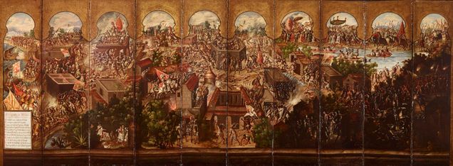
Another image that uses the same visual rhetoric, in terms of perspective and richly detailed depiction of territory, is a seventeenth-century biombo describing the conquest of Mexico. This folding screen, inspired by Japanese imports, features extraordinarily detailed oil on canvas landscapes in aerial perspective. The front side of the screen employs a dark palette and consists of ten panels depicting the Spanish conquest of Tenochtitlan, now Mexico City (fig. 3). In the lower left corner of the screen is a map key, which labels nine historic scenes spanning from the first meeting between Cortes and Moteuczoma to later rebellions against the Mexica tlatoani, or indigenous officials.

The reverse side of the screen (fig. 4) maintains the aerial perspective, but depicts a much brighter, more grid like scene of Mexico City as the newfound capital of the Spanish viceroyalty. The biombo as a whole, as scholar Kevin Terraciano explains, depicts the transformation from “a chaotic, crowded site of conflict” to “a spacious, orderly city.”5 This observation has a racial dimension that recalls Brenna Bhandar’s theorization of the circular, violent logic that stems from the relationship between the “proper” use of land and a weaponized concept of race, where non-European approaches to land management are denigrated and used as a justification for dispossession.6 In this case, the darker palette that characterizes the conquest side of the biombo appears significant, and potentially meaningful to the wealthy Creole or Spanish individual who lived with this screen and whose own sense of subjectivity would be supported by its version of history.
An anonymous biombo entitled Allegory of New Spain,7 from the early eighteenth century, presents an environment similar to the one described in the portrait of Musitú. This image depicts what the art historian Richard Kagan refers to as a “pleasure park,” or a specifically “Creole space” for leisure and recreation.8 The image suggests the significance of parks and gardens in the New Spanish imaginary, a theme that is reinforced by Kagan’s reading of another anonymous oil on canvas work from the early eighteenth century. Vista de la Alameda de México depicts an aerial view of Mexico City’s Alameda Park, a cultivated green space, located on the outskirts of the city, with a central fountain from which tree-lined walkways radiated (fig. 5). This symmetrical, geometric enclosure is presented as “a refuge from urban life”9 for the city’s Creole elite, although, as Kagan points out, its bucolic connotations are complicated by the inclusion of a stake at which Jewish victims of the Spanish Inquisition were burned. This dimension of the work is highlighted within the map legend in the painting’s lower right corner and suggests that the Alameda represented “a place indicative of the order, in the sense of policía, that Creole writers associated with the capital of New Spain.”10

Another illuminating example is found in an anonymous casta painting of 1775. Casta, or caste, paintings are a genre that flourished in eighteenth-century New Spain. They were pseudoscientific taxonomic works, which aimed to illustrate and label all the possible results of miscegenation in the viceroyalty. These images, which suggest both diversity and order, were created for and adorned the homes of Spanish and Creole individuals and were often taken back to Spain as souvenirs of the colonies. As such, they had a symbolic relationship to New Spain; their pseudo-scientific categorization represented an attempt at intellectual mastery and, by extension, control over a diverse society. This particular image, entitled De Alvina y Español Produce Negro Torna-Atrás, has a strikingly similar composition to that of Sáenz’s portrait of Musitú. In a slightly ambiguous balcony space on the left side of the foreground of the image, a wealthy man and a woman stand with their noticeably darker-skinned child. Behind and below them sprawls the intricately detailed, symmetrical space of the Alameda, where people (many of whom are dressed in bright shades of red that recall the cochineal curtains of the Musitú portrait) frolic and stroll in the shade.
In direct contrast to the portrait of Musitú, however, this casta image does not portray familial cohesion and the continuity of wealth and access. Rather, what is depicted is the resurgence (torna-atrás or turn-back) of blackness that has resulted from the union of a Spanish man and an “albina” woman, understood then to have been white passing but “one-eighth black.”11 As Kagan explains, the woman is shown kneeling in despair at what the viewer is supposed to understand as her loss of status and access to the exclusive space of the Alameda. Her husband, whose status as a white man is secure, turns away from her and their child in order to survey the expanse of the park.12 His position vis-a-vis the geometric space of the park, and his ability to know it through immediate, embodied observation, contributes to his unique subject position; while his Spanishness or whiteness allows him access, it is his physical presence in the Americas and established relationship to the land that gives him the sense of intellectual mastery encapsulated in his surveying instrument. Kagan’s reading of this image has significant implications for the interpretation of Sáenz’s portrait of Musitú. As a woman, Musitú’s whiteness is affirmed through the fact that her offspring hold the tools that will allow them to access, cultivate, and ultimately manage the garden space below. Whiteness, in its relationship to property, can thus be understood as a prerequisite for the kind of secular subjectivity that this image represents.
This reading is supported by several features of the space that are highlighted in the Musitú portrait; while less panoramic and comprehensive than the depictions of the Alameda and other similar cityscapes, the garden retains a sense of “rational cultivation” through its geometric layout. This rationality is undergirded by the fountain, which features recognizable subject matter. The fountain in the Musitú portrait echoes the cultivation around which the Alameda is centered and suggest a Versailles-like level of control over nature through its manipulation of water. It also features a prominent image of Neptune. As historian David Brading explains, references to classical mythology in the Americas became a way of articulating esoteric knowledge as well as a symbol of Creole identity, predicated on the eccentric but at one point widely cited argument that the Americas had an ancient connection to the lost city of Atlantis.13 In an effort to establish a history of the Americas that suited their complex aspirations, individuals who identified as criollo/a also attempted to draw parallels between the indigenous civilizations of the Western hemisphere and the civilizations of ancient Greece and Rome. The fountain in this portrait can thus be understood to function on multiple levels as a symbol of control over the land through the enforcement of the creole racial privileges.
That Sáenz’s portrait of Musitú partakes of the logic of whiteness in its relationship to elite identity can also be gleaned from comparison with a similar image about which significantly more is known. José de Páez’s Portrait of Francisco de Larrea y Vitorica and His Two Sons, Miguel José Joaquín and Pedro Nolasco José, painted in 1774, has strikingly similar subject matter. Francisco de Larrea y Vitorica, a finance administrator for the Marquisate of the Valley of Oaxaca who would eventually become its governor, is thought to have commissioned this painting while pursuing noble status (hidalguía) based on his Basque heritage. As noted by Ilona Katzew, this petitioning process involved testimonies of “blood purity” (limpieza de sangre).14 Katzew suggests that the portrait by José de Páez was likely produced as a component of the governor’s petition and that its emphasis on documentation and precision stems from this focus on legal evidence.
The labels that identify Francisco de Larrea y Vitorica and his sons refer back to the family crest adorning the upper right corner of the image; as Katzew notes, the “Basques and Cántabros who immigrated to the viceroyalties tended to be obsessed with emphasizing their place of origin in specific ways through inscriptions on portraits.”15 That the portrait of Musitú lacks such a lengthy inscription (the map-like key at the bottom includes only the full names of her two children, along with the date) supports the idea that she might have been a criolla, or a woman claiming Spanish descent born in the viceroyalties. Francisco de Larrea y Vitorica and his two sons occupy the foreground of their portrait. Like the Saenz portrait, in which Musitú anchors the image, Francisco de Larrea y Vitorica is painted at the center of the composition. With their tri-cornered hats tucked under their arms, the three men assume confident poses, cultivating a balance between a serene, self-assured stance and an upright formality. There is little in the way of the profusion of objects that characterizes the portrait of Musitú. Francisco de Larrea y Vitorica’s portrait features a large clock, which contributes to its commanding sense of order and precision, alongside a prominent coat of arms, to which the viewer’s eye is drawn by the sweep of the curtain in the background.
As I have argued, precision and the suggestion of temporality function differently, albeit to similar legitimizing effect, in the Portrait of Ramona Antonia Musitú y Valvide de Icazbalceta and her Two Daughters. While the authority of the clock is absent from Musitú’s portrait, time is not: the artist expresses a particular vision of continuity through land management, which is the thread that links the fountain in the background to Musitú’s young daughter’s watering can in the foreground. Whether this reflects gendered differences, Musitú’s possible Criolla (as opposed to Larrea’s Peninsular Spanish) identity, or both, I suggest that Juan de Sáenz’s portrait implies a sense of access to the land and its resources that is predicated on the articulation of racialized subjectivity and the fiction of whiteness. The relativity of race as a construct means that the viewer’s perspective determines whether or not Musitú is identified as a "white" woman in the twenty-first century, which in turn may condition the viewer’s assessment of the image’s modernity, ironically foreclosing an engagement with the facets of its meaning explored in this essay.
____________________
Rachel Bonner
Rachel Bonner is a third-year PhD student in Visual Studies at the University of California, Santa Cruz, where she focuses on transculturation and identity in the early modern Spanish Americas. She is an editorial board member and incoming assistant managing editor at Refract: An Open Access Visual Studies Journal.
____________________
Footnotes
1. The art and visual culture of the Spanish viceroyalties often subverts, or at least complicates, the religious/secular binary. The Virgin of Guadalupe, as both a religious figure and symbol of national identity, is one such example, as is Saint Rose of Lima. This is characteristic of early modern art on both sides of the Atlantic; Joseph Koerner’s famous reading of Dürer’s self-portrait of 1500, in The Moment of Self-Portraiture in German Renaissance Art, comes to mind.
2. Ilona Katzew, “Paintings of the Land,” in Painted in Mexico, 1700–1790: Pinxit Mexici, ed. Ilona Katzew (Los Angeles and Mexico City: Los Angeles County Museum of Art & Fomento Cultural Banamex, A.C., 2013).
3. Ibid., 294.
4. Throughout this article I use “Creole,” or the Spanish Criollo, as a period term, and do not intend to validate its connotations. By the eighteenth century, the label had a racial dimension, although “Spanishness” was originally conceived in religious terms, see María Elena Martínez, Genealogical Fictions: Limpieza de Sangre, Religion, and Gender in Colonial Mexico. (Palo Alto, CA: Stanford University Press, 2008).
5. Kevin Terraciano “Competing Memories of the Conquest of Mexico,” in Contested Visions in the Spanish Colonial World, ed. Ilona Katzew (London and New Haven, CT: Yale University Press, 2012), 75.
6. Brenna Bhandar, Colonial Lives of Property: Law, Land, and Racial Regimes of Ownership (Durham, NC, and London: Duke University Press, 2018).
7. Due to museum and office closures during the COVID-19 pandemic, I was unable to secure image permissions for most of the remaining works that I discuss in this article, many of which are in the same two collections.
8. Richard Kagan, Urban Images of the Hispanic World: 1493–1793 (London and New Haven, CT: Yale University Press, 2000), 161.
9. Ibid., 157.
10. Ibid., 157.
11. Ibid., 159.
12. Ibid., 159.
13. David A. Brading, The First America: The Spanish Monarchy, Creole Patriots, and the Liberal State 1492-1867 (London: Cambridge University Press, 1992).
14. Katzew, Painted in Mexico, 347.
15. Ibid., 347.
Edward Krasiński: Studio as Site of the Universal
by Nadia Gribkova

In the 1970s, a thin line of blue Scotch tape began its horizontal motion across the interior of Edward Krasiński’s (1925–2004) studio apartment in Warsaw, Poland (fig. 1). It crept across the walls and windows, covered furniture, photographs, paintings, and partition curtains. At times, the line would break—only to reemerge unchanged, faithful to its unyielding trajectory around the room, one hundred and thirty centimeters above the parquet floor, nineteen millimeters wide. Soon, it would breach the bounds of the artist’s Warsaw studio and mark the walls of museums and galleries around the world. But it was in his apartment, most intimate of interior spaces, that Krasiński developed the line as a material alternative to the painter’s brushstroke.
The design of one’s room is an exercise in world-creation, an extension of one’s vision into the inhabited space. The choice of the everyday material surfaces over the pictorial possibility of an autonomous art object is a daring declaration of aesthetic control over the mundane. In transferring the abstract gesture of the blue line into the interior, Krasiński overlaid his aesthetic vision onto the materiality of his surroundings and submitted the objecthood of his studio apartment to his pictorial will. As a result, the studio space appears to venture into the abstract.

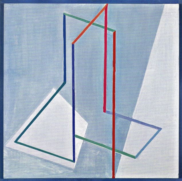
The blue line of Scotch tape is not only Krasiński’s signature mark, but also an illustration of the post-Stalinist-era aesthetic in Eastern Europe. It signals the broad rejection of Socialist Realism and highlights the artist’s alignment with the tradition of Western geometric abstraction and its connotations of a universal modernist culture. In both his writing and his art practice, one of the most ardent proponents of the universal potentiality of abstraction was Piet Mondrian (1872–1944), famous for his multi-colored compositions with rectangular planes (fig. 2). In his 1920 essay “Neo-Plasticism: The General Principle of Plastic Equivalence,” Mondrian declares the relation of abstract art to the universal: “Art must,” Mondrian writes, “be the direct expression of the universal in us—which is the exact appearance of the universal outside us.”1 Note here the implied necessity of a consonance between one’s interiority and the external world. For Mondrian, the issue at hand was not mere representation of the equilibrium, but also evocation of the universal within the viewer.

The idea of a universal realm that subverts geographical and political boundaries was understandably attractive to artists in post-Stalinist states. For several decades after the death of Joseph Stalin in 1953, the belief in art’s “universal character” promised to carry East-European artists over the Iron Curtain.2 This commitment was fueled, in part, by the wish to participate in the Western art world and make up the time lost to state-mandated Socialist Realist aesthetics. In his book In the Shadow of Yalta, art historian Piotr Piotrowski speaks to the commitment with which artists like Ivan Picelj (1924-2011) and Henryk Stażewski (1894-1988) explored the genres of non-objective painting, at times directly alluding to the artists of the Russian avant-garde (figs. 3, 4). The return to the material-oriented projects “of Constructivism and productivism, which mythologized the fusion of art and life” marked the beginning of what Piotrowsky calls neo-Constructivism.3 Piotrowsky understands the revival of Constructivist tendencies as a reaction against the neo-Classical and Socialist Realist aesthetics mandated by the Communist regime.4 However, it was Krasiński who uniquely moved beyond two-dimensional experiments and expanded the abstract realm of the avant-garde canvas to the scale of his living space.
“I don’t know if this is art,” Krasiński commented on his work with Scotch tape, “but, without any doubt, this is scotch ‘blue’: width 19mm, length unknown.”5 While Krasiński described himself as “Surrealist in life and almost Dadaist in art,” Piotrowski considers him in the context of the Eastern-European neo-Constructivist movement.6 For the art historian, the geometric nature of Krasiński’s line pays homage to the Constructivist tradition dedicated to emphasizing the material. The blue tape heightens both the abstract geometry of its linear motion and the hackneyed, deteriorating materiality of its cheap adhesive (fig. 5). The latter quality further dramatizes the line’s material intervention on the apartment’s surfaces; there is an element of surprise to encountering Scotch tape devoid of its utilitarian purpose, lending the work a prank-like quality. The interior of the studio thus fluctuates between a space of constructivist striving toward an abstract unity and a site of Dadaist mischief.

Krasiński’s apartment intervention suggests he shared a focus on geometric and mobile elements with early twentieth-century abstract and non-objective painters. The characterization of the line as having concrete and unchanging material qualities (width, color) indicates the importance of its unbroken trajectory. The idea of motion, specifically an infinite motion, is embedded in the relation of the line to the objects within the studio space. Unstoppable and unyielding, the line “transgresses space into infinity.”7 Despite the persistent materiality of the Scotch tape, it nonetheless serves as an abstracting element, entering the physical space of the studio and turning every object it touches into a surface, flattening the three-dimensionality of the interior.

In a 1975 work titled Intervention 15, Krasiński plays with the same tape and its movement from the physical space into a pictorial one (fig. 6). On a canvas, he creates a line drawing of two rectangular blocks joined at their long edges and opened up away from the viewer in a book-like fashion. A blue line runs across the gallery wall at its stable height of one hundred and thirty centimeters before entering the space of the canvas. The tape then changes its course, dropping down and back up to follow the surfaces of the geometric figures. At first sight, one could see this work as an example of the inversion of the line’s fidelity to the interior as a material plane. The blue tape does not simply run over the piece but submits to its illusionistic, three-dimensional space. The Scotch tape reacts to the three-dimensionality of the abstract configuration, while nonetheless continuing its treatment of the interior space as two-dimensional. However, one must keep in mind Krasiński’s characterization of his line: It is first and foremost a “scotch ‘blue,’” with concrete, invariable width and color. Nothing, not even trespassing into the conventionally pictorial sphere, influences the material qualities of the line.
Seen from this perspective, the “scotch ‘blue’” introduces materiality to the painting’s rigid geometry, equating it with the surface of the gallery wall. The tape does not change scale nor does Krasiński alter the height at which he mounts the tape. If one were to straighten the two blocks and put them flat against the gallery wall, the line would maintain its height from the floor. Krasiński does not entertain the abstract potential of the three-dimensional geometric objects nor of the striking black background of the canvas. The thin line is the ultimate equalizing, flattening force. While playing into the three-dimensionality proposed by the painting, the tape’s presence nonetheless strips its pictorial potential, announcing it identical to the inexpressive flat plane of the gallery wall.

Similar to Krasiński, Mondrian experimented with the relationship between pictorial representation and three-dimensional space of the room. The quintessential Western representative of pure abstraction also expanded his compositions beyond the material bounds of the canvas and into the physical interiority of the room (fig. 7). Mondrian approached the interior as an opportunity to model the universally holistic realm, a radical space of both material and abstract unity. Mondrian writes:
The interior of the home must no longer be an accumulation of rooms formed by four walls . . . but a construction of coloured and colourless planes, combined with furniture and equipment, which must be . . . constituent elements of the whole.8
However, Mondrian does not stop at simply material unity:
And the human being? In a similar fashion, the human being must be nothing in himself, but rather a part of the whole. Then, no longer conscious of his individuality, he will be happy in this earthly paradise that he himself has created.9
A photograph of his Parisian studio from 1926 shows how Mondrian allowed his colored planes to follow through with their expansive motions and erupt from the canvas (fig. 7). Large rectangles detach from the pictorial plane and are actualized in the material space of the room, adhering to the furniture and merging with the walls. Unlike in his compositions on canvas, black lines are completely absent in this arrangement. The verticals of the walls and the horizontals of the floor and ceiling serve as a point of reference for neo-plastic planes. Mondrian’s studio is a miniature of the ever-expansive, all-engaging neo-plastic infinity he theorized. The easel, reminiscent of an abandoned grid, stands empty before a large mid-tone rectangle that expands on the wall behind it. Another easel, on the left-most side of the photo, still holds the canvas that is releasing the colored rectangles from its surface. Through the movement of the colored planes, the room comes alive.
Totality then, in its Western modernist sense, relies on all becoming a part of a whole, on the blurring of boundaries between the inside and the outside, between the personal and the universal. In working on his studio, Krasiński is hesitant to embrace this idea as an axiom and appears to push against it however inconspicuously. In an enclosed area with a cupboard and a telephone, Krasiński puts up an array of images and objects in an almost Mondrian-like grid (fig. 5). The rectangles and squares of magazine cut-outs, photos of friends, notes on loose pieces of paper, and a golden frame are implanted onto the studio’s wall. The photographs are arranged around the blue line, as if placed after it has traced the surface. And although for a second the line experiences a rupture—as if someone’s hand has ripped the tape for a friend’s photograph to remain unmarked—it picks up a little later and continues its stable run. This private shrine to the sentimental stays put in its designated corner.
The interior of Krasiński’s studio is circumscribed into a closed infinity manifest through the material quality of Scotch tape. Geometric abstraction here is not centrifugal, not expanding, but rather containing, enclosing.10 The abstract line interacts with images and objects in the room on the level of the material surface. The blue line, in that way, negates the expressive potential of a wall plane as a canvas and turns it instead into a medium for the progression of material through space. The allusion to expansion from a central focus and pictorial transcendence present in Mondrian’s works is being categorically denied here. The studio is marked by infinity, but an infinity so tangible, so loyal to its material immediacy, that it is incapable of allowing anything but an object to be what Mondrian describes as “part of a whole.”
Krasiński’s line does not organize the pictorial space but declares it a surface, creating the opposite effect to the one Mondrian attempts to orchestrate in his Parisian studio. For Mondrian, the room is alive, pulsing with interrelated colored planes, while Krasiński emphasizes the lifeless quality of all surfaces. In this way, the flatlining of the Scotch tape is an embodiment of a pulse, or a lack thereof. An interpretation of the line’s flatness as a cardiac metaphor is hardly a stretch—the height of the line is described by some reviewers as being located at the viewer’s heart level.11
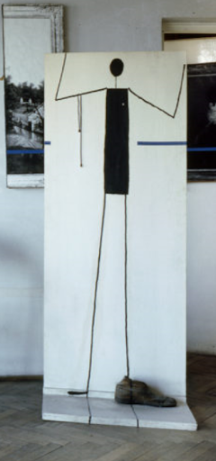
The Warsaw studio apartment achieves wholeness by having its interior bound by the continuous motion and materiality of the “scotch ‘blue.’” Such infinity ceases being universal and becomes particular. In other words, Krasiński’s universe is that of a room, focusing on the immediate materiality of its surfaces. The blue line as an artistic gesture does not appear to share Mondrian’s optimism about the prospect of merging the human with the abstracted whole. Krasiński alludes to a human physical presence by establishing a spatial connection to the onlooker’s heart, only to meet it with a cool, geometric rigidity. The human is here rendered flat—nothing but a stick figure on a sheet of plywood (fig. 8). It is as if the artist gives form to an inhabitant of this totality, a man who, in Mondrian words, is “nothing in himself.”12 Looking closely at the figure, one cannot help but wonder whether Mondrian’s promise that “he will be happy in this earthly paradise that he himself has created”13 is at all a possibility.
In post-Stalinist Eastern Europe, the stakes of seriously engaging with the ideas of the universal were undoubtedly high. Not in the least because of the political implications of the possibility and hope of aligning with a modernist West, culturally antithetical to the restrictive bounds of the Communist regime, were markedly fraught. The injection of rigid special materiality into the modernist non-objective practice can be read as a serious attempt to adopt universal ideals. In this regard, Krasiński’s studio is a peculiar example of geometric abstraction taking over the material world and claiming it as a static, enclosed infinity of utilitarian Scotch tape. In looking at the studio one cannot help but think of Mondrian’s query, “And the human being?” The uncompromising neo-Constructivist line highlights the very thing that might have to be left behind in the process of achieving the modernist ideal: the pictures of friends, and one’s personal history. In using the language of the modernist geometric gesture, Krasiński points to the shortcomings of the attempts to express a universal whole via the materialization of abstraction. In the end, a unity is experienced not through a line drawn but a space inhabited.
____________________
Nadia Gribkova
Nadia Gribkova is a PhD student at the University of Illinois at Chicago. Her research interests include modern and contemporary Russian art, mass spectacles, and unofficial art movements in the late Soviet Union.
____________________
Footnotes
1. See Piet Mondrian, “Neo-plasticism: The General Principles of Plastic Equivalence,” in Art in Theory, 1900–2000: An Anthology of Changing Ideas, eds. Charles Harrison and Paul Wood (Malden, MA: Blackwell, 2002).
2. Piotr Piotrowski, “Myths of Geometry” in In the Shadow of Yalta, (London: Reaktion Books Ltd, 2009), 144.
3. Ibid., 143.
4. Ibid., 141.
5. In the original Polish text, “blue” is written in English, with quotation marks demarcating it, tying the gesture even closer to the Western art world, Włodzimierz Borowski et al., Galeria Foksal, 1966–1994 (Warsaw, Poland: Galeria Foksal SBWA, 1994), quoted in Piotr Piotrovski, “Myths of Geometry,” 120.
6. Stanislaw Cichowicz, “Z historii niebieskiego humoru,” in Edward Krasiński, ed. Janina Ładnowska (Łódź, Poland: Muzeum Sztuki w Łódźi, 1991), quoted in Piotrowski, “Myths of Geometry,” 119.
7. Piotrowski, “Myths of Geometry,” 119.
8. Cees de Jong, et al., Piet Mondrian: the Studios: Amsterdam, Laren, Paris, London, New York, (London: Thames & Hudson, 2015), 6.
9. Ibid., 6.
10. Rosalind E. Krauss, The Originality of the Avant-Garde and Other Modernist Myths (Cambridge, MA: The MIT Press, 1986), 18.
11. Laura Robertson, “‘IT Intervenes IN and Unmasks EVERYTHING. IT Exists’ — Into the Studio: Edward Krasiński, Warsaw,” The Double Negative, October 19, 2016, www.thedoublenegative.co.uk/2016/10/it-intervenes-in-and-unmasks-everything-it-exists-into-the-studio-edward-krasinski-warsaw/.
12. Jong, et al., Piet Mondrian, 6.
13. Ibid., pg. 6.
Memories and Connections: Remote Field Study of a Bodhisattva Hall in Sannohe, Aomori, Japan
by Mew Lingjun Jiang

This report focuses on a single Kannon zushi (観音厨子 or a portable shrine dedicated to a bodhisattva) decorated with karuta (from the Portuguese carta, or patterned playing cards). This piece is located at Nose Kannon Hall (野瀬観音堂 Nose Kannon-dō) in Sannohe, Aomori, Japan (figs. 1-a and 1-b). The study, done remotely through online meetings and interviews with Sannohe locals, sought to preserve memories of this particular place during the challenging COVID-19 pandemic.1 Through the process, I gathered documents and images for my in-progress project to trace the history of Buddhist-Shinto integration and the use of karuta images in religious practices in Sannohe.

The zushi at the hall is perhaps the only known piece in Japan covered with karuta. This decorative approach creates a visually compelling pattern of unique abstract designs and strong black-red contrast (fig. 1-a). In addition to the zushi’s appearance, the enshrined Shinto and Buddhist deities also make the hall a curious place. While the hall enshrines a “True Bodhisattva” (聖観音 Shō-Kannon) wooden sculpture, the zushi conceals a bronze plate with a relief image of a “hanging buddha” (懸け仏 kakebotoke) as “The Deity of Gambling” (賭け事の神様 Kakegoto no kamisama) (fig. 1-b and fig. 2 ).2 The connection between the kakebotoke Buddhist icon and the Deity of Gambling is made through a pun: “to hang” (懸ける kakeru) sounds like the word “to gamble” (賭ける kakeru). 3 Although the origin of the Deity is unclear, the belief in “The Great Deity of Karuta” (カルタ大明神 karuta daimyōjin) as a playful wish of karuta players has been portrayed in seventeenth- and eighteenth-century popular fiction, with abstract karuta figures reinterpreted beyond the gaming context.4

The decorated karuta, which might demonstrate karuta players’ devotion to the deity, are carefully nailed onto the zushi to cover its surface, forming unique visual patterns in black and red using the four highly simplified suit markers of batons, swords, cups, and coins.5 Cards on the front were arranged into four magic-square groups: in the squares, the pip numbers in any of the outer horizontal and vertical lines add up to 15, while any horizontal, vertical, or diagonal line crossing the center has a sum of 25 due to the special layout (see figs. 3-a and 3-b).


The cards are “kurofuda” (黒札), a kind of regional bold-patterned karuta, developed and used in Northeastern Japan in the late nineteenth and mid-twentieth centuries, and derived from the illustrated Portuguese-patterned four-suit playing cards introduced by European merchants in the late sixteenth century. To accelerate the printing process to meet the demand created by popular card games, karuta design became abstract and simplified. The meanings of karuta figures were reassigned by local players, who used new rules and names in their games. Karuta, like the ones decorating the zushi, even developed new functions as religious items. However, because the current zushi was rebuilt after a fire in the 1930s, it is unknown when the devotion to the Deity of Gambling started in Sannohe, or whether these cards represent the same type of karuta used at that time. The old zushi survived and is still stored in the hall, with a few cards remaining on its surfaces, and its history requires further investigation. (fig. 4).6
Since 1617, Nose Kannon Hall has been managed by the Kudō family and used for religious events which display the usually-concealed kakebotoke.7 Visitors today still offer card decks to the deity for luck in games and lotteries.8 Although Nose Kannon Hall occupies a distant location on a mountain, hours away from the nearest town, the decennial public opening attracts worshippers and visitors curious about karuta and traditional games. Articles as well as videos uploaded by visitors attracted more viewers online and called attention to the intriguing appearance of the zushi and the religious traditions in Sannohe.
The public opening scheduled for this year has been postponed to August 2021, when I plan to visit the site to conduct an actual field study to obtain more information and images of Nose Kannon Hall. With this project, I hope to call attention to religious traditions developed by local communities outside major areas and to form a more comprehensive history of the change in karuta designs and usage beyond games and gambling. As long as these places and stories are remembered, they will continue as a part of the shared memory of the local community and of our humanity.
____________________
Mew Lingjun Jiang
Mew Lingjun Jiang studies Japanese art history focusing on prints and ephemera. This current project looks into the reinterpretation of signs and meaning-making of images in karuta. Handling them is like holding a time-travel pass. Some colleagues joked that it was the Great Deity of Karuta that guided Mew here.
____________________
Footnotes
1. This field report was an outcome of online collaborations with traditional game collectors, researchers, and linguists in Japan. Initially, I planned to visit Nose with other researchers in summer 2020, but due to travel restrictions under the pandemic, we had to cancel the plan. Instead, the study resumed as a remote project connecting people from different regions. I am indebted to those who met with me online: Takashi Ebashi, Yuka Hayashi and her colleagues from the National Institute of Japanese Language and Linguistics, Takuma Itō, Mariko Iwasaki, Hiroyasu Kudō, Yuka Morikawa, Hironori Takahashi, and Nobuaki Takerube. Special thanks to Sannohe Town, Sannohe Board of Education, and Aomori Prefecture Library for providing contacts and documents. And special thanks to Mariko Iwasaki for kindly sharing her interview and photographs. Thanks to Or Porath and Fabio Rambelli for encouraging me to reach out to the locals as the first step of this study.
2. The Shō Kannon, or Noble/True Kannon is one of the Six Kannon Bodhisattvas in Japanese Buddhism. Its icon is presented as idealized and humanlike and is “the most commonly represented manifestation of Kannon.” See Sherry D. Fowler, Accounts and Images of Six Kannon in Japan (Honolulu, HI: University of Hawai’i Press, 2016), 17–8; The kakebotoke “hanging buddha,” also called mishōtai 御正体, is a tradition since the medieval age to indicate the identity of the Shinto kami deity and to present the kami’s body in a materialized form, influenced by Buddhist iconography. The current enshrined kakebotoke bronze plate relief in Nose Kannon Hall was made in the 1930s after a fire, while the old plate is still stored inside the shrine. Interview by Iwasaki Mariko and Noda Takashi with Nose Kannon Hall superintendent Kudō Hiroyasu in Sannohe, Aomori, September 6, 2020.
3. An observation by Takuma Itō.
4. For instance, the deity of karuta has been portrayed in Ihara Saikaku 井原西鶴, “A Man Coming to Ponto (Ponto ni oite kita otoko 先斗に置いてきた男)” in Twenty Undutiful Stories in Japan [Honchō nijyū fu kō 本町二十不孝], 1686, and Saikaku, “The Deity of Karuta that Does Not Fulfill One’s Wish (Inoredo kikanu karuta daimyōjin no koto 祈れど聴かぬ骨牌大明神の事)” in The Portable Inkstone [Futokoro suzuri 懐硯], 1687; the spirit of karuta in Santo Kyōden 山東京伝, Ohana and Hanshichi’s Buddhist Benefits and Card Games [Ohana Hanshichi kaichō riyaku mekuriai お花半七開帳利益札遊合], 1778, and the personification of karuta in Kyōden, An Unavailing Allegory of Karuta [Hyakumon nishu mudakaruta 百文二朱寓骨牌], 1787.
5. Cards were allegedly devoted and placed by visitors coming from Towada (in Aomori, north to Sannohe), interview, September 6, 2020.
6. Sannohe-machi Kyōiku-iinkai 三戸町教育委員会, “Nose Kannon Gaiyō” 野瀬観音概要, manuscript, received April 30, 2020, and interview, September 6, 2020.
7. The public opening used to happen every sixty years, then every thirty years, and now every ten years. According to Kudō, this change was to bring in more visitors to view the public opening: if the public opening happened only every sixty years, one visitor would only have one chance in their life to view the Bodhisattva icon, Sannohe chōshi chūkan, 264, and interview, September 6, 2020.
8. Reported by Nobuaki Takerube, who visited Nose in the 2000s, and interview, September 6, 2020.
at HOME by Alice Quaresma
Pablo’s Birthday, New York
September 17–October 25, 2020
by J. English Cook

In his elegiac ruminations in The Poetics of Space (1958), Gaston Bachelard describes the intimate, sensuous associations that we often apply to the notion of home. Unexpectedly, his prose foreshadowed the confrontations between emotional and architectural interiority in our contemporary pandemic times. “Memories of the outside world,” he writes, “will never have the same tonality as those of home and, by recalling these memories, we add to our store of dreams. . . .”1 Bachelard’s slippage between factual recollections and poetry, physical space and dreams is at the forefront of at HOME, a solo exhibition of photography-based, mixed media works by Alice Quaresma at the New York City gallery Pablo’s Birthday.2
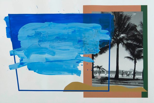
Conceived during the COVID-19 lockdown, the show revealed Quaresma’s own ruminations on the state of physically isolated living. “As a good traveler,” she writes, “whenever I cannot physically be somewhere, I travel in my mind, I use my imagination.”3 Drawing upon her memories of living in both New York and Rio de Janeiro, her hometown, the exhibition conveyed the emotional connections that accrue from fluid experiences of “home.” In light of travel restrictions and confined to her home-cum-studio in Brooklyn, Quaresma mined her photographic collection from both cities, colorfully collaging, transposing, or collating her images into an effervescent curatorial and artistic statement (fig. 1). Through experimental combinations of texture, shape, and figuration; pigments and photography; and the play between individual works and holistic environments, Quaresma creates a convivial atmosphere in which two-dimensional gallery objects evoke the experience of three-dimensional exterior spaces.
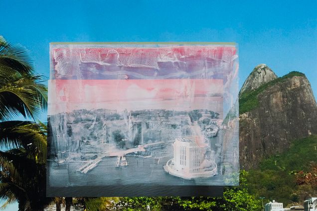
In order to create works from home that speak to a deeper sense of feeling at home—or the loss thereof—Quaresma applies a wide range of strategies. The titles of individual works like Faraway, Disconnected, and Adrenaline,for example, convey different affective associations with the aerial and landscape views of her respective cities, while works like Dreaming with Eyes Open and Somewhere in My Mind gesture to a more introspective take on the intersections between material and emotive space. Clash, in particular, visualizes the dialectics at the heart of at HOME: a photographic print of New York City’s coastline, faded in shades of grey, has been doused in painterly pink and white gouache (fig. 2). Taped onto a vivid reproduction of Rio’s Two Brothers peaks (Morro Dois Irmãos), the subdued, mottled tones of New York’s coast—under lockdown at the time of Quaresma’s making—renders the city faded and hazily distant.4 Despite being this work’s place of origin, the Big Apple pales in comparison to the flushed saturation of Brazil’s luscious landscape, geographically distant but imaginatively close. New York’s waterfront, for example, is pictured at a remove from above, in contrast to the more proximate, eye-level view of Rio’s shores. Additionally, Quaresma’s use of broad, messy strokes and visible adhesive contrasts with the balance of clean geometric shapes, juxtaposing her artistic process against formal composition. Her indexical marks, however, slip slightly over the black-and-white photograph’s right-hand edge, briefly submerging both figurative realms within the translucent windowpane of painterly marks. Quaresma’s embodied memories, in this sense, become syntactically intertwined.
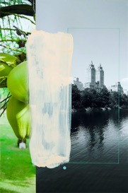
Introspective applies a similar approach, pairing a close-up of vibrant, lime-green fruit with a distant, black-and-white view of The Eldorado residence overlooking Central Park (fig. 3). A combination of acrylic paint, color pencil, and stickered-over photographic print, this work frames, accents, and punctuates its subjects, establishing an emotive syntax within a visual, visceral grammar.
This method of using contrasting representational styles to convey embodied experience belongs to a longstanding, international tradition of twentieth-century abstraction.5 Like many of these artists, Quaresma contrasts distinctive brushwork with structured geometries to communicate a sensual engagement with her canvas. Her gestural color gradients, punctuation-like shapes, and cut-out stylings connect the viewer, indexically, to her emotive associations at the time of making, as seen in the interplay of brush strokes and bold lines in Summer Days (fig. 4). Part of what distinguishes Quaresma’s work in the twenty-first century, however, is the application of these earlier practices to photography, creating a poetic vocabulary that playfully and incisively reveals the medium’s oneiric attachment to the material world. As Bachelard would conclude, in describing the home: “we are never real historians, but always near poets.”6 By reflecting on themes of personal attachment, displacement, and imaginary travel while inside, Quaresma’s exhibition followed suit, functioning as a lively form of critique that pointed to an important stake of art and criticism in the time of COVID-19: opening up avenues for poetic catharsis within the interior spaces of our makeshift quarantine homes, wherever and whenever in the world they may be.
____________________
J. English Cook
J. English Cook is a writer, curator, and PhD candidate at the Institute of Fine Arts, New York University. Her research focuses on historical intersections between cinema, architecture, and philosophy, particularly as expressed in material adaptations of postwar phenomenology between France and Italy.
____________________
Footnotes
1. Gaston Bachelard, The Poetics of Space, trans. Maria Jolas (Boston, MA: Beacon Press, 1994), 6.
2. Alice Quaresma, “Press Release: at HOME,” (New York: Pablo’s Birthday, 2020).
3. Ibid.
4. In the exhibition’s press release, Quaresma explains that during lockdown, she “stopped traveling, and the only place [she] could explore was within [her] imagination,” Ibid.
5. In an interview conducted by the gallery, Quaresma referenced Lygia Pape, Lygia Clark, and Hélio Oiticica—members of Brazil’s Neo-Concrete Movement—as explicit references. Alice Quaresma, “Interview with Alice Quaresma,” interview by Clara Andrade Pereira, Pablo’s Birthday, New York, 2020.
6. Bachelard, The Poetics of Space, 6.
Notes about Contributors
Shannon Bewley was the Provenance Research Fellow in the departments of American and European Art at the Birmingham Museum of Art prior to entering Boston University as a PhD student in the Department of History of Art and Architecture. Her research areas include sculpture and conceptual art, with special attention to photographs of conceptual art and participatory sculpture.
Rachel Bonner is a third-year PhD student in Visual Studies at the University of California, Santa Cruz, where she focuses on transculturation and identity in the early modern Spanish Americas. She is an editorial board member and incoming assistant managing editor at Refract: An Open Access Visual Studies Journal.
J. English Cook is a writer, curator, and PhD candidate at the Institute of Fine Arts, New York University. Her research focuses on historical intersections between cinema, architecture, and philosophy, particularly as expressed in material adaptations of postwar phenomenology between France and Italy.
Nadia Gribkova is a PhD student at the University of Illinois at Chicago. Her research interests include modern and contemporary Russian art, mass spectacles, and unofficial art movements in the late Soviet Union.
Mew Lingjun Jiang studies Japanese art history focusing on prints and ephemera. This current project looks into the reinterpretation of signs and meaning-making of images in karuta. Handling them is like holding a time-travel pass. Some colleagues joked that it was the Great Deity of Karuta that guided Mew here.
Katie Elizabeth Ligmond is a PhD student of Visual Studies at the University of California, Santa Cruz. She researches Andean empires, primarily how textiles functioned within imperial ideology. She also studies world Catholic traditions, ethnic survival under imperial domination, and women's roles in the development of states.
María de Lourdes Mariño is an Art History PhD student at the Tyler School of Art and Architecture, Temple University. Her area of research is modern and contemporary Caribbean and Latinx art. Before attending Temple University, she was professor at University of the Arts (ISA) and Independent Art Curator in Havana, Cuba.
Amelie Ochs studied Art and Visual History, History and Humanities in Berlin, Paris, and Dresden. Since 2019 she has worked as a research assistant at the University of Bremen / Mariann Steegmann Institute Art & Gender. Her dissertation examines the context of image consumption and display strategies in early twentieth century still-life photography.
Michael Rangel is a social worker, scholar, and writer in Chicago, Illinois. He holds a MSW. in Social Work from Loyola University Chicago and a MA in Critical Ethnic Studies from DePaul University. His research focuses on the intersections of race, sexuality, performance, carcerality, and queer/trans identities.
Tyler Rockey is a PhD student at Temple University specializing in the art of early modern Italy. His research interests include the persistence of the classical tradition, Renaissance-era philosophy and theories of art, antiquities collecting, and the physical, temporal, and semiotic instabilities of ancient sculptures in the early modern context.
Rosanna Umbach studied Art – Media – Aesthetic Education and Cultural Studies, Art and Cultural Mediation at the University Bremen. Her dissertation project Un/Gewohnte Beziehungsweisen examines family concepts depicted in the display of Schöner Wohnen magazine (1960–1970). Since 2017, she has held the Mariann-Steegmann-Scholarship.
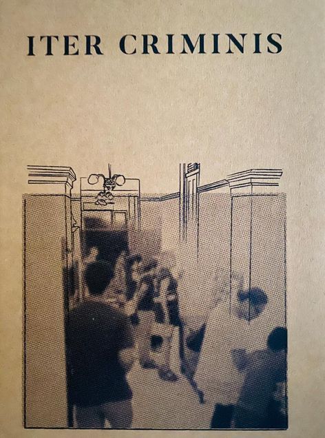
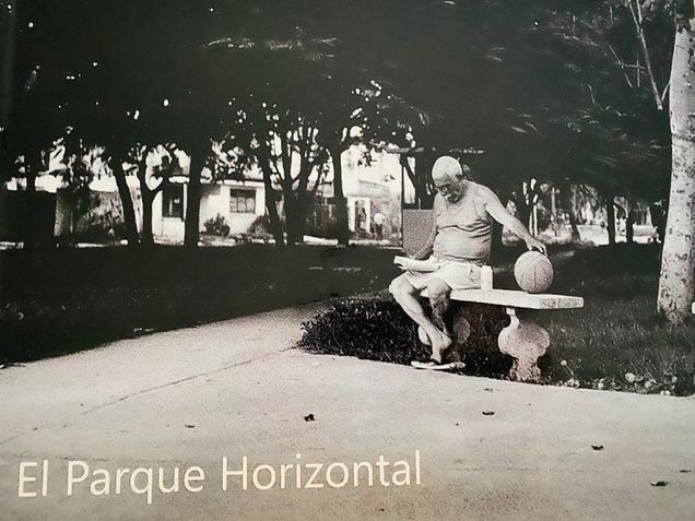
Iter Criminis and El Parque Horizontal: Two Independent Art Catalogues in Cuba
Isel Arango
Iter Criminis
La Plata: Arte Editorial Servicop, 2020. 44 pp.; 297 x 21cm.
9789878397689
Anamely Ramos
El Parque Horizontal
La Plata: Arte Editorial Servicop, 2020. 56 pp.; 265 x 20 cm.
9789878397849
by María de Lourdes Mariño
In Cuba, within the last decade, artistic expression outside of state institutions has become a cultural movement. These artistic practices—unconventional within the art scene of the country—are often overlooked by cultural officials because they develop in the intimacy of private homes and border on what can be considered "illegal gatherings." Iter Criminis and El Parque Horizontal are two catalogues that identify some of the protagonists in the contemporary Cuban alternative cultural movement. These publications, which were released last October in Argentina with a grant from the NGO Cultura Democrática, intend to create awareness around undercurrent artistic, literary, and curatorial practices of a younger generation in Cuba. These catalogues reflect on the merging boundaries of subjectivity, interiority, and the politics surrounding space and public participation.
Iter Criminis was an exhibition curated by Isel Arango that took place in November 2019 in the province of Camaguey. The curator opened her home to display processual drawings in different formats of eleven artists and writers. The exhibition of unfinished drawings, presented illegally in a private sphere, is a curatorial practice that reflects on the fragile nature of public space in Cuba. Although only a few pieces directly engaged in political critique, the event itself challenged the restrictions which exist to prevent gatherings like this one, filling the absence of independent exhibitions outside of the capital. The catalogue served as an effort to preserve the memory of events taking place in the rest of the country. Arango wrote a brief introduction explaining her path to the crime of organizing this show, as the recently approved Decree 349 criminalized the status of independent cultural workers in Cuba. She also provided a short introduction on each artist, accompanied by photographs of each exhibited piece. Lastly, Arango included an article by Cuban writer Rafael Almanza, reflecting on the exhibition and its civic value.
El Parque Horizontal by Anamely Ramos is a curatorial research project originally conceived as an art exhibition but that, as a consequence of the pandemic, has been developed on social media and only recently manifested as a printed catalogue. It ponders the symbolic value of an emblematic public space in Havana since 1959: the Revolution Square. In the presentation of the catalogue, the curator compares the square’s design to a previous urban plan from the beginning of the 20th century, which proposed a more horizontal and human-scale solution, connected to the city. Ramos appropriates the story of this path-not-taken while centering her procedure on the identification of artists and cultural projects that will eventually bring, symbolically, the same sense of openness and integration to the realised urban plan. This catalogue reviews different artistic experiences in Havana’s contemporary underground culture. Authors with diverse backgrounds collaborated on the book, creating a volume without a clear structure as the compilation of texts covers the full spectrum from promotional to literary in character. In congruence with the horizontal practices gathered in the book, Ramos’s publication functions less as a fixed material than as a transient gathering of information, free interpretation, and casual encounters.
Both publications inhabit Cuba’s in-between spaces of public and private, legal and criminalized, as well as professional and amateur practices. These are spaces nurtured by personal stories. These environments create expressions of the public and communal in the secrecy of secluded homes and restricted networks of friends. Also, both projects include Cuban artists living abroad, which poses a critique to the narrow nationalistic narrative imposed by the official cultural institutions. Maybe because it is less ambitious, Iter Criminis better satisfies the notion of a traditional art catalogue. By contrast, El Parque Horizontal, still an ongoing project, feels like an unfinished endeavor. By locating an area of cultural production that grows in spite of the many controls imposed by state institutions, both publications aim to provide not just records of events, but also to demonstrate the possibilities of a future Cuban society built through horizontal collaboration and unrestricted creativity.
____________________
María de Lourdes Mariño
María de Lourdes Mariño is an art history Ph.D. student at the Tyler School of Art and Architecture, Temple University. Her area of research is modern and contemporary Caribbean and Latinx art. Before attending Temple University, she was professor at University of the Arts (ISA) and Independent Art Curator in Havana, Cuba.
____________________
Jessica Burko
Shelter in Place Gallery, Boston
October 6–9, 2020
by Shannon Bewley
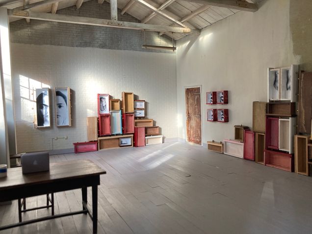
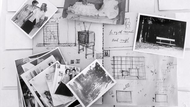
Jessica Burko’s latest sculptural installation at Shelter in Place Gallery (SIP) in Boston, Massachusetts, consisted of assemblages of found furniture and photographs (fig. 1). Her stacked vintage dresser drawers leaned against the gallery walls. Red and blue drawers provided a pop of color among a sea of wood tones. Black-and-white encaustic photo transfers lined some of the drawers’ bottoms, depicting a scrap of paper, a wishbone, a baby doll with a bottle, and a puzzle piece. These wood containers presented their contents like relics from the attic. The exhibition’s accompanying text suggested that Burko was drawn to their ability to compartmentalize “the detritus of daily life.”1
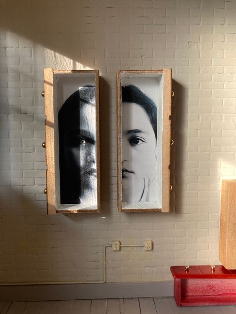
These drawers also held photographs of body parts, such as a lipsticked mouth or children’s feet. The close cropping of the images represents how the mind distills events into specific moments and images. Yet the photographs’ distorted scale and blurry focus shows that these are not actual mementos but memories of them. Our recollections of cherished objects, like photographs, no longer match the actual toys hidden in the forgotten corners of childhood dresser. Near the gallery windows, two long drawers hung in tandem on the white brick wall with left and right halves of two women’s faces peering out from the wall to form a single portrait (fig. 2). These separated bodies could be read in light of the physical separation required during the ongoing COVID-19 pandemic, while the vintage images of the toys suggest the growing distance between our recollections of life before and after the virus. Yet, little else about Burko’s exhibition indicated that both the works and the venue were adaptations to current social-distancing constraints. Nothing about the space immediately revealed that SIP is a 1:12 scale model, where one inch equals one foot (fig. 3). Its exhibitions, all equally small, are only accessed through images posted online. Most viewers “visit” the gallery through its Instagram feed.
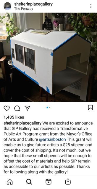
SIP debuted in March 2020 at the onset of the COVID-19 pandemic. Founder Eben Haines and his partner Delaney Dameron sought to offer Boston-area artists an accessible space to envision large installations and to continue exhibiting during the global health crisis. Haines, a practicing artist and graphic designer for the Museum of Fine Arts, Boston, previously created an elaborate twenty-by-thirty-inch gallery maquette to plan out his own paintings. Now, his precise model presents other artists’ miniature works, which are conveyed to Haines’s and Dameron’s doorstep through contactless delivery. The vast majority of SIP’s artists, like Burko, do not comment on the context or size of the exhibition space in their works.
SIP was awarded a Transformative Public Art Program Grant from the City of Boston Mayor’s Office of Arts and Culture in June 2020. The award of these public funds to Haines and Dameron acknowledged the gallery’s ability to connect citizens of Boston to each other, and the gallery’s equivalence to other enduring community projects like murals. As other institutions remain closed, SIP’s social media platform offers a safe, virtual gathering space for Boston’s arts community. Yet the novelty of this model, like social distancing amid an international pandemic, has worn into normalcy. For the artists, the desire to play with the format of the space has faded in favor of the chance to present their works to a bigger audience. SIP’s Instagram profile welcomes visitors 27/4 without the logistical burdens of museum buildings. SIP signals a viable new era of pandemic-proof digital arts institutions for artists like Jessica Burko, whose exhibition allows us the opportunity to contemplate narratives and histories both of and beyond the current moment.
____________________
Shannon Bewley
Shannon Bewley was the Provenance Research Fellow in the departments of American and European Art at the Birmingham Museum of Art prior to entering Boston University as a PhD student in the Department of History of Art and Architecture. Her research areas include sculpture and conceptual art, with special attention to photographs of conceptual art and participatory sculpture.
____________________
Footnotes
1. Shelter In Place Gallery (SIP) (@shelterinplacegallery), “Good morning from the gallery! The air is crisp, and the slanting light is playing very nicely with two large installation works by @jessicaburko,” Instagram photo, October 7, 2020, https://www.instagram.com/p/CGC0SWtlROZ/?utm_source=ig_web_copy_link.
Editors’ Introduction
by İkbal Dursunoğlu

This issue of SEQUITUR reflects upon the “Interiors” of our architectural and psychological boundaries, and witnesses how the overlap of these physical and mental spaces creates both shelters of intimacy and sites of estrangement. Despite writing on one of the most durable, and yet most flexible, features of human existence, and around diverse temporalities from antiquity to the present and covering a global scope, there is a remarkable thematic consistency to the explorations of our authors. Subjectivity and access emerge as the two central sub-themes of this issue, which perhaps tells us as much about our current shared condition as it does about the specific subject matters covered.
Human subjectivity and indoor space appear mutually constitutive of each other, at present as in the past. But this subjectivity is always contingent upon the level of access and control that one has to a space, to its knowledge, to its resources, and to the world external to it. The examinations presented here, of varying configurations of access and denial in diverse temporal and cultural contexts, provide incredibly rich glimpses of the myriad ways in which our relationships to interior space have taken shape. Sometimes human subjectivity has organically developed in tandem with indoor space and, while designing it, we also gave form to our own selves. At other times, a discovery of space parallel to our existence has thrown new light on and changed the ways in which we defined our identity. And at yet other times, we have had to build subjectivity against the restrictions imposed in the spaces we have inhabited.
In a fascinatingly varied array of feature essays, these questions are explored in full range and nuance. Rachel Bonner situates the eighteenth-century portrait of Ramona Antonia Musitú y Valvide Icazbalceta by Juan de Sáenz in the broader tradition of New Spanish representations of the American territories. She radically analyzes Musitú’s portrait through politics of racially defined land-ownership, arguing that the portrait both lent and denied agency to its sitter at the same time. In her thoughtful contemplation of Edward Krasiński’s employment of a blue Scotch Tape to circumscribe the walls of his Warsaw studio apartment in the 1970s, Nadia Gribkova contends that while this gesture placed the artist within a larger twentieth-century avant-garde abstract art movement, his positionality as the citizen of a post-Stalinist country was reflected in a hesitation to participate in an all-encompassing, exhaustive universalism. In a truly interdisciplinary study, Katie Ligmond traces the formal and intellectual links between Wari urban and tomb layouts and Inka textiles. In doing so, she reveals that the adoption of similar grid structures, which the Inka possibly inherited from the Wari, point to analogous patterns of obfuscation and control. In both societies, the elites had seemingly exclusive access to the logic underlying these patterns at the expense of the commoners, indicating the parallel mechanisms of imperial power they employed. Tyler Rockey presents a richly textured account of the Renaissance discovery of an ancient Roman palatial ruin, and the subsequent artistic recreation of this space in the Logetta of Cardinal Bibbiena in the Vatican. Rockey interprets this transposition within the context of humanist endeavors to revive the city of ancient Rome in the sixteenth-century present, and argues that, by this gesture, the Logetta and its ancient source became heterotopic spaces where multiple temporalities collided and accustomed norms were altered.
The research spotlights featured in this issue offer notes on exciting work in progress on completely different subjects that nevertheless resonate well with each other. Mew Lingjun Jiang present their preliminary findings on a portable bodhisattva shrine, currently located in Sannohe, Aomori, Japan, dedicated to the Deity of Gambling and covered with Portuguese-inspired playing cards. Jiang’s report reflects on how the cult of this deity bridges the seventeenth century to our day through continuous practice, and a remote rural Japanese town to the rest of the nation even during the pandemic. In their research spotlight, Amelie Ochs and Rosanna Umbach analyze how postwar German lifestyle and home-decoration magazines participate in the formation of modern national subjectivities by shaping notions of the ideal dwelling, and, by extension, the ideal citizen, via strategic employment of design elements such as layout, imagery, and typography.
Both of the book reviews featured in this issue reflect on the ways that art offers strategies of resistance to repression under restrictive environments. María de Lourdes Mariño reviews two independent art catalogues, Iter Criminis and El Parque Horizontal, curated by Isel Arango and Anamely Ramos respectively. Both of these catalogues grew from a Cuban alternative cultural movement that seeks to create and maintain art spaces independent from central state institutions of culture, radically claiming the private space of the home as a site of underground artistic gatherings in the face of criminalization by the state. Michael Rangel reviews Nicole Fleetwood’s Marking Time: Art in the Age of Mass Incarceration, focusing on artists imprisoned by the United States prison system, heavily biased along racial and class lines. Fleetwood identifies a carceral aesthetics, emerging from within the prison system, which brings both “invisibility and hyper-visibility to those incarcerated and their art,” to quote Rangel.
Against this grim landscape, the exhibition reviews in this issue offer brighter prospects, though perhaps only to those of us who are able to enjoy them. Shannon Bewley examines Jessica Burko’s exhibition at Shelter in Place Gallery, Boston—a gallery space creatively designed to enable local artists to reach their audiences even under quarantine conditions through social media. In her tiny exhibition of found furniture and photographic material, Burko explores the ramifications of a socially distanced life wherein the home space is discovered anew. Alice Quaresma’s exhibition at HOME, displayed at Pablo’s Birthday in New York City and also online, presents a much warmer view of the home, as described by Josephine English Cook. Through a series of photographic mixed-media works, the artist ruminates over displacement, restrictions on travel, and the intimacy of feeling at home.
The image of interiors that rises from this collection of writings might be imagined as reminiscent of the illustration that accompanies this introduction. In the scene, Alexander the Great of the Persian tradition visits the court of Nushaba, the Queen of Barda’, in disguise; yet the latter wisely succeeds in identifying him from his portrait. After a long conversation followed by convivial feasting, Alexander leaves the court, which he had visited to spy, as a more enlightened man. The painting captures the moment of recognition: under the spy’s nervously watching eyes, Nushaba gracefully points at his portrait. This resonates with the essays presented here, where our authors observe that human subjectivity often takes form in interior space through the agency of art. In the illustration, the restricted space of the court serves as the stage where Alexander’s identity is discovered and his personality subsequently reshaped—humbled but bettered—in this elegant conversation around a painting. The rarified nature of the gathering ensures that Nushaba’s knowledge is available only to a select few.
Thus, issues of access, like those that haunt the accounts of our authors, demarcate the levels of this painting and define the reach of its figures. The gathering takes place exclusively behind the shut gates of a castle beyond unreachable mountains, but in open air, in a courtyard that connects to the garden that we see on the right. As the host, Nushaba is seated on a dais in an iwan, a rectangular vaulted hall walled on three sides, with one side entirely open to the outside. This central space of authority is inaccessible to any other figure in the painting. Movement through the doors to different spaces of the palatial complex is possible, but highly regulated. Inside the folds of the complex, seen in the upper parts of the illustration, various figures perform their duties or direct their gazes downwards from above at the happenings of the court, their view not as readily available from below, with a distance both endowing and denying them access to knowledge at the same time.
We hope that this issue of SEQUITUR performs as a welcoming virtual space of interiority with open access to knowledge and inspiration, helping to build positive agency and empowerment in the never-ending process of selfhood construction.
Wohnseiten: The Interior(s) of Home Journals
by Rosanna Umbach and Amelie Ochs
Initiated by Irene Nierhaus and Kathrin Heinz in 2015, Wohnseiten is a research project based at the Mariann Steegmann Institute Art & Gender in cooperation with the University of Bremen, Germany. It has been developed in the Institute’s main research field wohnen+/-ausstellen (“dwelling+/-exhibiting”), which addresses the visualization of the concepts of dwelling and exhibiting in their interlinked discourses. This research field analyzes dwelling as a concept and process of residence, as well as practices of living and exhibiting as part of complex display strategies.
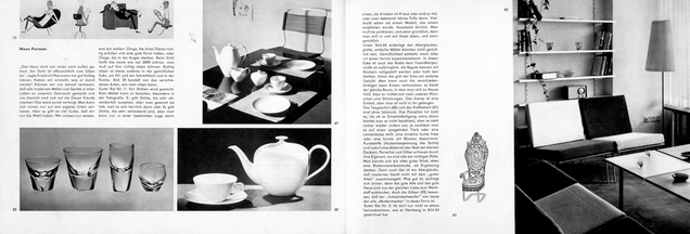
Wohnseiten examines home journals spanning from the nineteenth century to the present in order to analyze their serial, didactic aesthetics.1 The project contends with the following questions: How does the magazine, as a format, produce discourses on dwelling and, thus, living? To what extent does the interplay of text and image mediate, formulate, or design specific forms of subjectivation? The aesthetic structure of the lifestyle magazines reveals power constellations through which occupants and readers are addressed as socially and politically active, gendered, and consuming subjects. The magazine’s instructional content on how to dwell "properly" has gradually established dwelling as a social and aesthetic practice.2 Normalized images of dwelling have been developed through their repeated visualization in home magazines, shaping hegemonic ideas of space and occupants. Thus, magazines form intertwined “displays” that are linked to specific socio-political discourses correlating to their period of publication.3
Our field report aims to contribute to the existing scholarship on interiors and types of dwellings by bringing new focus to the interiors of home journals as socially-constructed spaces. Relying on the findings of our research, we locate the home journal in the center of a media-based discourse on dwelling/living.4 In the following, we demonstrate how display strategies function as didactic instructions, from a postwar picture book to current social media interfaces.
Figure 1 shows a double-page spread taken from a Bilderbuch (“picture book”) published by the Deutscher Werkbund in 1958.5 A photograph of a mid-century living-room interior, which fills half of the right-hand page, catches the viewer’s gaze. Next to the photograph, a caricatured drawing of an anachronistic piece of furniture—half historicist arm chair, half modernist tubular steel chair—is depicted in small scale. On the left-hand page, three photographs of glassware and tea sets alongside another small-scale drawing, showing four types of chairs in order to exaggerate the depiction of different types of seating, stand out from the type area. The meaning of the bold title, Neue Formen (“New Forms”), is explained by the accompanying text. Emphasizing modesty and simplicity, it describes only the merits of these new forms, represented by the “plain” glassware, tea sets, and living room furniture in the photographs. In contrast to these qualities, the text says that furniture like the armchair in the caricature should be avoided. The reason for this refusal is not mentioned; it is left to the reader’s imagination, which is trained by the picture book’s selection of images. Through numerous examples and using a rhetoric that highlights reduced modernist designs, the picture book teaches the viewer/reader to reject ornate forms. Thus, what is formulated here is not only advice about how a living room should be furnished, but also norms of living. This conclusion is supported not only by the hierarchy of the photographs over the drawings, but also by the whole arrangement of the type area.6
The previous example draws on a tradition of manuals for how to design the domestic interior (Wohnratgeber), which frequently appeared in various forms in the first half of the twentieth century. After the Second World War, the picture book introduced a new order of reality to a generation of young citizens within the Federal Republic of Germany. For this purpose, the picture book takes up the modernist (visual) rhetoric by confronting old and new designs from everyday life. The manuals’ didactic narratives were not only taken up by the picture book, but also by home journals like Schöner Wohnen (“More Beautiful Living”).
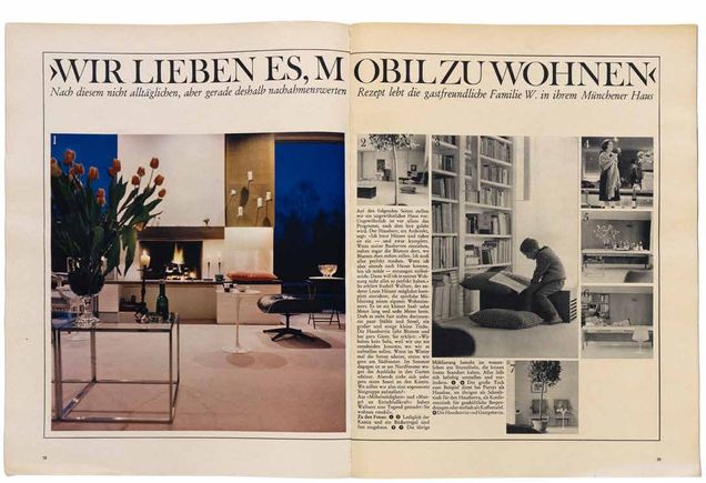
In 1965, Schöner Wohnen depicted the "agile" life of the Wallner family in the report titled “Wir Lieben Es, Mobil zu Wohnen” (“We Love Living Mobile”) (fig. 2). Mobile living is introduced as an “unusual program” of living, which consists of versatile and portable furniture that can adapt to the occupants’ needs and that correlates to a certain modernist idea of a flexible way of life.7 The first double-page spread consists mostly of square-format photographs, arranged as modules, surrounding narrow text columns. It seems as if the ideals of mobile living and flexible interiors are conceptually translated in the layout’s style: Not only does the aesthetic structure (in this example: the arrangement of images and typography) proclaim the idea of mobile living, but the images themselves also do so. One photograph shows a child in a home library reading a magazine that is propped up by a pillow. The child sits on a wooden bench—a piece of portable furniture that creates a temporary Leselandschaft (reading landscape). The magazine spread’s seven images, including this one, produce a narrative where the subject should be just as flexible as the interior itself. Mobile dwelling is presented as a “recipe worth copying” that needs to be learned, and Schöner Wohnen educates its readers/viewers by providing supposedly authentic examples of how to create a modern interior and, thus, how to become a modern citizen.8
In the twenty-first century, ideas of "proper" dwelling are (re-)presented in IKEA catalogs, in television series, on Instagram, and in blogs. The lifestyle magazine tries to incorporate social media into its narrative and aesthetic structure.9 Living at Home + Holly, for example, is labeled as Europe’s first influencer magazine for interiors. It is curated by blogger Holly Becker, an American expat from Boston now living and working in Hannover, Germany.10 Some of the magazine’s pages imitate layouts used in social media, thus linking the printed page to the visual grid of Instagram. The magazine’s social media account, in addition to other interior blogs, is shaping representations of home and interior aesthetics, taking up didactic display strategies as the Schöner Wohnen did in the 1960s. Today, the "readers" can also be part of the (visual) narrative by responding directly through comments or by using the same hashtags to link their own posted Instagram photographs to a certain discursive archive.11 Pictures posted on social media give insight into ostensibly "authentic" but often carefully-arranged interiors; we do not see dust bunnies, dirty dishes next to the bed, or the actions of homemaking in the pictures. Instead, we see well-composed arrangements and fragmented close-ups of furniture. The pictures are subtitled with a multitude of hashtags indicating that the viewer is facing "#scandistyle" or "#coziness." They collectively serve as yet another translation of internalized visual patterns that demand that the subject exhibit images of their home and reproduce ideas of the "right" way to dwell.
Within the research group Wohnseiten, which focuses on magazines, journals, and media networks, we call attention to specific display strategies and discuss their implications for society. We address magazines as central elements of the (re-)production of Wohnwissen (“knowledge about dwelling”), or a reflection of social conditions and ideals, historically disseminated through various media.12 Through the given examples, we have tried to show how visual elements like images; typography; graphics and illustrations; and floor plans and diagrams design a specific idea of dwelling. The picture book teaches the viewer/reader to compare images in order to make out the differences between the depicted designs: while the double-page spread is the tableau for comparative visual analysis, the ideologically-organized interplay of text and image is the foundation of the viewer’s aesthetic judgement. The latter is the book’s objective.
In the display of Schöner Wohnen, magazine images and texts are interlinked to form a discursive aesthetic structure that instructs readers by showing them ostensibly "authentic" examples of furnishing and living in a "modern" home. Living at Home + Holly demonstrates how digital discourses and interfaces are integrated into the aesthetic structure of the magazine, connecting different types of media in its display. What is more, these didactic implications are even more pronounced and interactive when social media becomes a platform where former readers transform the internalized ideas of the "right" way to dwell by exhibiting their own homes using the same aesthetic imagery and display strategies as those found in home journals.
Wohnseiten aims to connect to other institutions and researchers working on the topic of the home journals’ interior(s), aesthetic structures and social implications. Following the success of our first conference on the topic in 2019,we are currently establishing an early career researchers’ colloquium series.13
____________________
Rosanna Umbach
Rosanna Umbach studied Art – Media – Aesthetic Education and Cultural Studies, Art and Cultural Mediation at the University Bremen. Her dissertation project Un/Gewohnte Beziehungsweisen examines family concepts depicted in the display of Schöner Wohnen magazine (1960–1970). Since 2017 she is holder of the Mariann-Steegmann-Scholarship.
Amelie Ochs
Amelie Ochs studied Art and Visual History, History and Humanities in Berlin, Paris, and Dresden. Since 2019 she has worked as a research assistant at the University of Bremen / Mariann Steegmann Institute Art & Gender. Her dissertation examines the context of image consumption and display strategies in early 20th century still life photography.
____________________
Footnotes
1. The project’s full title is “Lifestyle Pages – German language home journals from the nineteenth century to the present and their dissemination as media.” Although the English translation describes its objective very well, we would like to stick to the German term Wohnseiten. This term contains the noun “Wohnen” which indicates both the practice of living (at home) and the home’s condition (respectively dwelling/housing). The compound "Wohnseiten" indicates both: the pages of the lifestyle magazine and the different possibilities ("sides") of living. For further information on the project, see https://mariann-steegmann-institut.de/forschungsprofil/.
2. Research on this topic is relatively new and mainly located in the fields of design studies, architecture, and art history. Our focus on the (modern) magazine as a format that offers important insights into the discourse on dwelling was influenced by Jeremy Aynsley. See Jeremy Aynsely and Francesca Berry, "Publishing the Modern Home: Magazines and the Domestic-Interior 1870‒1965," Journal of Design History 18, no. 1 (2005): 1–5, https://doi.org/10.1093/jdh/epi001. See also Jeremy Aynsley, and Kate Forde, eds., Design and the Modern Magazine (Manchester, UK: University Press, 2007).
3. Irene Nierhaus, "Seiten des Wohnens – Wohnzeitschriften und ihr medialer und gesellschaftspolitischer Display," in FKW//Zeitschrift für Geschlechterforschung und Visuelle Kultur, no. 64 (Seitenweise Wohnen. Mediale Einschreibungen, ed. Katharina Eck, Kathrin Heinz, and Irene Nierhaus, 2018), 18–28.
4. See Irene Nierhaus, Kathrin Heinz, and Rosanna Umbach, eds., WohnSeiten. Visuelle Konstruktionen des Wohnens in Zeitschriften (Schriftenreihe wohnen+/-ausstellen, Bielefeld, Germany: Transcript, 2021).
5. Clara Menck’s Ein Bilderbuch des Deutschen Werkbundes für junge Leute (Düsseldorf: Rotations-Kupfertiefdruck L. Schwann, n.d. [1958]) is a 30-page leaflet rather than a picture book. It was addressed to 14- to 20-year-olds, and intended as an introduction to good form.
6. The magazine’s materiality stands out due to various forms of images and text fragments, arranged on bundled pages. Text, photography, and drawings relate to each other in the ways they are placed in the type area. In our research, mainly two theoretical concepts help us to approach the designed (double) page: Dagmar Venohr’s term "iconotext" and Sybille Krämer’s concept of Schriftbildlichkeit ("the script’s/page’s figurativeness"). The latter consists of four aspects: (1) The aspect of structure, i.e. the standing of a statement or an image on the designed page; (2) the visible and the invisible; (3) the production and revocation of meaning; and (4) the text’s anti-hermeneutic dimension which makes interpretation easier. See Sybille Krämer, “‘Schriftbildlichkeit’ oder: Über eine (fast) vergessene Dimension der Schrift,” in Bild – Schrift – Zahl, eds. Sybille Krämer and Horst Bredekamp (München: Wilhelm Fink, 2008), 157–76. Dagmar Venohr describes the magazine’s aesthetic structure as an “iconotextual COMPOSITION.” The use of color, typography, and graphic(s), as well as the visual correspondences and contrasts produced by them, must be analyzed in order to decipher the magazine’s “iconotextual NARRATION,” Dagmar Venohr, medium macht mode. Zur Ikonotextualität der Modezeitschrift (Bielefeld, Germany: Transcript, 2010), 113f (emphasis in original).
7. “Wir lieben es, mobil zu wohnen,” Schöner Wohnen 6, no. 10 (1965): 38–9.
8. Ibid.
9. In the second episode of their radio show Wohnfrequenz – Zuhörgespräche über Wohnbilder, Anna-Katharina Riedel, and Rosanna Umbach discuss the issue 1/2020 of Living at Home + Holly and how layout, strategies of (re-)presentation, and aesthetic structures of both print and social media are interlinked in its display. See https://sphere-radio.net.
10. The first issue was published in 2019. The magazine is read by German-speaking countries in Europe, but it has an English language version on ePapers.
11. Schöner Wohnen as a thematic archive is discussed in Anna-Katharina Riedel, “Präsentationsfläche Tisch. Angeleitetes Anordnen in Serie auf den Titelblättern der Schöner Wohnen zwischen 1980–1999,” in WohnSeiten: Visuelle Konstruktionen des Wohnens in Zeitschriften, eds. Irene Nierhaus, Kathrin Heinz, and Rosanna Umbach (Schriftenreihe wohnen+/-ausstellen, Bielefeld, Germany: Transcript, 2021).
12. Irene Nierhaus and Andreas Nierhaus, “Wohnen Zeigen. Schau_Plätze des Wohnwissens,” in Wohnen Zeigen. Modelle und Akteure des Wohnens in Architektur und visueller Kultur (Schriftenreihe wohnen+/-ausstellen, Bielefeld, Germany: Transcript, 2014), 9–35.
13. See the documentation in the volume WohnSeiten, cf. footnote 4.