Why the Change?
Blackboard will implement several improvements to address common usability challenges:
- Better use of screen space
- Fewer navigation errors
- Improved performance
- Clear context
- Reduced issues
What do these changes look like?
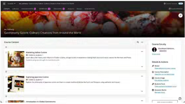
- Overall, it’s a cleaner layout that provides easy access to the main navigation tabs with less clutter.
- Courses now open in full-screen mode, maximizing horizontal space and reducing visual clutter.
- The course banner now spans the full width of the screen, freeing up vertical space and improving contextual clarity.
- A Home button is now available to return users to the Course Page.
- A more streamlined navigation experience is available, providing the ability to quickly move between courses.
- Removing the prominent “Exit (X)” to leave a course.
Full-screen pages for top-level panels
Courses now open in full-screen mode, maximizing horizontal space and reducing visual clutter. Navigation applies to top-level panels only (Course Content Homepage, Calendar, Announcements, Discussions, Gradebook, Analytics, Groups, and Achievements).
Full-width banner
The course banner now spans the full width of the screen, with title overlaid—freeing up vertical space and improving contextual clarity.

Home button to leave the course
The traditional “X” to exit a course has been replaced with a Home button, which returns users to the Course Page. The “X” remains for lower-level panels, such as learning modules.
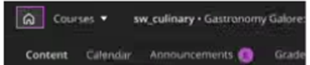
Course switcher
A more streamlined navigation experience between courses, with the ability to quickly jump between courses from within any course
![]()