news
Editors’ Introduction

This issue of SEQUITUR brings to readers work on multiple, multifaceted, and overlapping concepts of “text/ure.” Through a focus on the element of texture itself as a material quality of surface, we hope to deliberately emphasize haptic experience in the contents of this issue, rather than limiting exploration to the optic realm, so frequently privileged in art-historical discourse. Further, by highlighting textual elements of the works examined in this issue, which some of our authors have chosen to treat with semiotic methodology enjoying revived popularity in scholarship of the digital age, this issue acknowledges the textured encounters between these works, their makers, and their viewers.
Our feature essay, by Anni Pullagura, delights in the possibilities of such material and semiotic convergences. She approaches the haptic qualities and aesthetic tensions “embodied” by the spectral, sculptural works of contemporary artist Kevin Beasley, who uses aural feedback networks to give “voice” to his resin-drenched figures.
Julia Wilson’s visual essay explores a related and twofold form of aesthetic strain. She does this by first remixing photographic images with fractured text, then, by capturing the digital product with a large-format camera. This method calls attention to the existence of the computer screen as both container and medium, in turn pushing against the boundaries of how viewers perceive both surface texture as well as the relationship between text and image as it unfolds across that surface.
The two research spotlights in this issue examine the relationships between materiality, function, and meaning while dealing with issues of the history of race in America in some capacity. Mariah Gruner’s work on an early-nineteenth-century cradle quilt demonstrates how the “soft politics” of white American women abolitionists manifested themselves within and beyond the world of needlework. Kate Sunderlin’s field report from the studio of Edward V. Valentine, a Richmond-based sculptor who held some troubling views on racial equality, explores the ways in which a group of plaster sculptures of African Americans entered into dialogue with other plaster works present in the studio where they were displayed.
Althea Ruoppo’s interview with Mitra Abbaspour and Calvin Brown, co-curators of Frank Stella Unbound: Literature and Printmaking, reveals that the artist’s graphic oeuvre used and interpreted narratives through abstract forms. Here, we learn how the relationship between text and image is pushed to encompass not just a response to, but an alternative expression of those literary forms after which Stella named his print series.
Both of the exhibition reviews, Sasha Goldman’s on Under a Dismal Boston Skyline and Alex Yen’s on Animal-Shaped Vessels from the Ancient World, round out our issue by reporting on the ways in which curators are demonstrating the textual, social-historical, and material connections that exist within and among groups of historic works
Overall, the contents of this issue intends to leave the reader with a richer understanding of how the element of texture can be conceptualized in a way that enriches and complicates our understanding of a given work or group of works in a way that reaches far beyond mere surface.
The Editors would like to take this opportunity to extend a special thank you to everyone who has had a hand in the redesign of our journal's website, especially to Susan Rice for her tech support, Morgan Hamilton for his coding expertise, Isaac Goldman for the design of our new logo, and our Senior Editor Kimber Chewning for her initiative, leadership, and enthusiasm throughout the process.
Ali Terndrup
Plaster and Process – The Studio of Edward V. Valentine

Plaster sculptures appeared in nineteenth-century homes, studios, museums, and schools, and their use and reception varied in each of these contexts. My dissertation considers the works of two American artists, both of whom worked with and displayed plasters in their studios, and had close ties to the museums displaying plasters to a wider public. To illuminate the roles and uses of plaster in the sculptor’s studio, I examine the studio of Richmond-based sculptor Edward Valentine (Fig. 1). The plaster cast collection of the Valentine Museum (founded by Edward’s brother) will be examined in order to understand plaster’s function within the public museum. By closely analyzing Valentine’s correspondence, works, and related documents (such as contracts with clients or foundries), I reveal not only the role of plaster in his process, but also the professional ecosystem that existed to support and create his work. In turn, this case study tells us about the use of plaster and the practices of plaster-modelers in the period more broadly. My research thus far has revealed professional ties to other sculptors and plaster-modelers in both Richmond, Virginia and New York City.

I also consider how Valentine, his clients, and visitors to his studio felt about the use of plaster aesthetically through anecdotal evidence, personal correspondence, and newspaper articles. How did viewers approach plaster objects in the artist’s studio? What can their impressions tell us about larger sociocultural and political trends or beliefs? One example of the outcome of such inquiry comes from the chapter I am currently writing, a section on Valentine’s series of plaster sculptures of African Americans – The Nation’s Ward, Knowledge is Power, and Uncle Henry (Ancien Regime) – a challenging subset of his oeuvre (Figs. 2, 3, and 4, ). All three works reveal not only Valentine’s own personal racist sentiments, but also the pervasive racism and bigotry of the era, evidenced in the sculptural narrative and formal qualities of each piece.

Race as a concept underwent profound development during the eighteenth and nineteenth centuries. One of the most pernicious attempts to establish a racial hierarchy came from the measurement and comparison of crania, particularly the work of Pieter Camper. Diagrammatic charts published alongside his lectures seemingly presented a hierarchy of mankind from ape to Apollo, with the European next to the Greek god, and the African next to the ape (Fig. 5). That the Apollo Belvedere was chosen to represent the highest visual ideal is significant. In his Reflections on the Painting and Sculpture of the Greeks (1755), Winckelmann argued that Classical sculpture should serve as a model for modern artists, especially in learning to capture the ideal – the emotional, intellectual essence and perfected physical form of a subject – devoting a particularly effusive passage to the Apollo Belvedere. Despite the fact that there was early evidence for the use of polychromy by the Greeks and Romans, whiteness remained an important aspect of Winckelmann’s ideal and it was about more than just sculpture’s emphasis on form. That plaster is inherently a white medium cannot be overlooked and its whiteness in conjunction with its use to reproduce the classical sculptural canon, a canon now closely linked to Europeans, reinforces the linkage of white racial superiority to the classical tradition privileged Euro-American institutions of arts and education.

Valentine’s first work cast in plaster was a copy of the bust of the Apollo Belvedere in his father’s home, itself a reproduction. In copying from this sculpture, Valentine became part of a larger Euro-American academic tradition that privileged Classical statuary. Furthermore, owning and displaying such a copy was meant to exemplify his perceived social, racial, and intellectual superiority from which his elite status as a member of Richmond’s high society was derived. As a result, Valentine kept it in his studio for the rest of his life. Thus, this copy and his three sculptures of African Americans would have been in visual dialogue in his studio, reproducing in three dimensions Camper’s damning diagrammatic chart.
While the depressed economic climate in the South immediately after the Civil War kept the commissioning of monumental marble or bronze public sculpture at bay, it did support the production of portrait busts and figurative sculpture cast in plaster and sold commercially. Plaster’s whiteness demanded that the subjects’ blackness be made visible in other ways (or doubly visible when painted). The half-length bust of The Nation’s Ward depicts a young African American boy wearing worn clothing and a military cap, part of a Civil War uniform. When visiting Valentine’s studio, two ladies visiting from the North viewed the piece and one “said what a pretty name and sentiment it was, but on conversing with a Southern gentleman found it was meant as a satire.” Valentine has relied upon the use of stereotypical features “such as thick protruding lips, flared nostrils, and kinky hair” to identify this figure as a person of black African descent. This work is an example of a racist caricature, the picaninny, extremely popular at the time and for most of this country’s history. By drawing upon the character of the picaninny, Valentine is reinforcing the stereotype of African Americans as lazy, often portrayed in cartoons of the era as comical in their indolence and ignorance. He seems to be making a cruel joke at their expense, masked as “good humor,” ridiculing what he and others perceived as their misguided reliance on the Federal government in the postwar era. It was Valentine’s bigoted and bitter answer to the national debates over the work ethic of and economic opportunities for the nation’s recently freed African American men and women, amusing only to other bigoted elite white viewers. Plaster’s versatility and affordability allowed for the replication of imagery, from the Classical ideal to the modern caricature, and all its attendant ideologies, from the implicitly to explicitly racist.

Kate Sunderlin
Soft Politics: The Frictions of Abolitionist Women’s Needlework

Textiles are thought to be soft objects, saturated with care and memory. Present at our most vulnerable moments, they dab at tears, wipe up messes, swaddle fragile bodies, cover nakedness. The weight of a quilt comforts us, its formal familiarity promises continuity. I investigate the persistence of these textile narratives, their alignment with cultural constructions of femininity, the status of the implicit woman behind the cloth, and their discursive deployment. I research women’s decorative needlework in the United States and its relationship, in the cultural imaginary, with softness, sentiment, and nostalgia. What has sedimented in embroidery, as a medium, technique, and discursive construction? What frictions are embedded in the relationship between its cultural construction, its use, and its strategic deployment? In “Soft Politics: The Frictions of Abolitionist Women’s Needlework,” a chapter from my dissertation, “ I examine the work of white women in the abolitionist movement in the 1830s-1850s in order to explore these broader questions of the political meanings of work so consistently read as paradigmatically outside of the realm of both “work” and “politics.” This essay outlines my initial research into this portion of my dissertation project.
Even by the 1830s, needlework was understood as a nostalgic icon of the home, a representative of naturalized “women’s work” (unwaged, but thought of as an outpouring of love), a practice associated with an imagined, pre-industrial past. Needlework practice and discourse in the nineteenth-century aligned women’s embroidery with the images of the “Colonial Goodwife” and the “Republican Mother,” simultaneously celebrating women’s national influence as mothers and moral actors and establishing a discourse of separate spheres. This discourse created a conceptual framework that worked to bound that influence within the home (both as a literal space and a conceptual one, constructed in opposition to the notions of the public as a space of overt politics, fast pace, transactionalism, and masculinity). I argue that women also used this framework to make space for themselves, infusing their “domestic” textiles with political weight, public commentary, and market-savvy aesthetics. They used softness as a tool of puncture.
In “Soft Politics,” I work with women’s antislavery textiles to understand the complex dynamics of their deployments of femininity, softness, and domesticity in a political movement that, at best, uneasily incorporated women as participants. The American Anti-Slavery Society split in 1840 over the question of women’s full participation and the first women’s rights convention in 1848 was planned in response to the exclusion of women delegates at the London World Antislavery Convention.[1] Yet women continued to participate in the abolitionist movement as speakers, fundraisers, writers, and even organizers and members of their own antislavery societies, sewing circles, and antislavery fairs. Women’s fair and fundraising work was a key source of income for the antislavery movement through the 1840s and 1850s, one that enabled their political participation while maintaining associations with domestic feminity.[2] These fairs were sophisticated operations, organized by large committees of women and featuring, for sale, “domestic crafts” that otherwise would have been understood as products of the unremunerated labors of a refined, genteel woman, rather than politicized objects or objects sold for compensation. The sale of handkerchiefs, needle books, fancywork embroidery, workbags, and other crafts at antislavery fairs and bazaars gave women the opportunity to see themselves as political actors and earners, while still drawing on the associations with domesticity, morality, sewing circles, and women’s “benevolent work.”[3] These fairs confirmed both the economic value of women’s domestic (“ornamental”) pursuits and their political force; many of the objects sold both materially and aesthetically announced their makers’ (and purchasers’) political commitments.[4] Among these objects is a cradle quilt, sold at the Boston Female Anti-Slavery Fair in 1836. Although the object is not signed, it corresponds to a quilt that Lydia Maria Child described making and selling at this fair, suggesting a lineage in the hands of one of the great abolitionists of the early nineteenth century.[5]
As part of a research trip supported by a grant from the Decorative Arts Trust, I spent portions of the summer of 2018 traveling to the archives at Historic New England, the Peabody Essex Museum, and Colonial Williamsburg to examine abolitionist textiles (figures 1 & 2). At Historic New England, I encountered this quilt, stitched in an unassuming, classic Evening Star motif. The quilt, a cradle quilt meant for a child’s bed, is small (measuring only thirty-six by forty-six inches) and closely worked in fine hand-stitching. Its colors are muted and soft, an accumulation of printed cotton blocks in pink, blue, and brown star patterns; at first glance, this is not a remarkable quilt. However, the maker clearly played upon the quilt’s anticipated home in a cradle, using the implied anticipation of a maternal, sentimental scene as an occasion to insert an overtly political message. Delicately inked in the quilt’s central star is a hand-written stanza from Eliza Lee Cabot Follen’s poem, “Remember the Slave”: “Mother! When around your child/ You clasp your arms in love./ And when with grateful joy you raise/ Your eyes to God above,-/ Think of the negro mother, when/ Her child is torn away,/ Sold for a little slave- oh/ For that poor mother pray!”

This poem demonstrates the political stakes threaded through the maternal relationship and the domestic scene, asking women to consider the contrast between their moments of relative domestic serenity and the fundamental cruelties of enslavement.[6] It harnesses the softness of the quilt and contrasts it with the puncture of political commentary. Although the poem does go on to extend sympathy to “the poor young slave,/ Who never felt your joy,” the stanza that marks this quilt implicitly questioned the scene of white domestic love and pleasure, asking its players to consider whether it was grounded on the exploitation and exclusion of others.[7] The quilt asks those who encounter it to split their consciousness, countering the notion that quilts, or textiles in general, serve to wrap up, to hold, to comfort.
Angelina Grimké, one of the only white Southern women known to have joined the abolitionist movement, literalized the textural dimension of this form of textile activism in the antislavery movement in her writings.[8] In her “Appeal to the Christian Woman of the South, Grimké wrote of the layered work done by women in anti-slavery societies, bringing together notions of moral work and physical labor in her descriptions of the creation of antislavery crafts for sale at fundraiser fairs.[9] She helps confirm that women’s antislavery crafts often involved the physical representation of the body of an imagined enslaved person, writing that women were “telling the story of the colored man’s wrongs, praying for his deliverance, and representing his kneeling image constantly before the public eye on bags and needle-books, card-racks, pen-wipers, pin-cushions, &c. Even the children of the north are inscribing on their handy work, ‘May the points of our needles prick the slaveholder’s conscience.” Her writings consistently highlighted the ways in which women might remake political debate by centering their own cultural construction as moral, religious anchors of the home; their domestic position, ironically, became the justification for their emergence into the public sphere. In her discussion of abolitionist women’s craft work, Grimké deftly wove together Christian morality, maternal influence, textile production, public presence, and the textural contrast of the needle through cloth to evoke the force of the political commentary of “innocents.”
My work considers the active construction of the “innocent” subject position, its relationship to the supposed benevolence of textiles, and the limits of its political salience. In the context of the early nineteenth century, “innocent” was a subject position foisted upon both women (“protected” from the exigencies of the political and economic worlds by the system of coverture) and children, a signal of their dependence and, therefore, justification for their exclusion from full civic identity. However, it could function as a strategic claim of women and children (typically, white women and children, although abolitionists also worked to extend this category to black women and children). By announcing their sentimental purity, their status as “moral mothers,” women justified their political platforms. But my research questions both the racial dynamics of these claims and whether they helped reify or undermine gendered associations between femininity, domesticity, and depoliticized existence. Though I have found a few interesting examples of ornamental needlework by African American women during this time period and do not wish to whitewash the abolitionist movement, the majority of women participating in these specific antislavery craft practices were white. In these women’s hands, what (or who) did the cradle quilt’s contrast between the white, loving, domestic mother and the black, bereft, laboring mother serve? These makers exploited the friction of juxtaposition, contrasting the sharp puncture of their needle and message with the maternal embrace of the quilt, the femininity of the decorative stitch. This formal contrast undergirded a second juxtaposition, one between their own white status and that of enslaved persons. But this second juxtaposition of status also served as a point of comparison, an occasion for white women to call attention to their own unremunerated labors, their own exploited states.[10] What did this frictive layering generate?
This fundamental question has led me to consider the politics of white sympathy and the commonplace notion that the abolitionist movement was the political staging ground for the women’s suffrage movement. Read through this historical lens, it becomes all the more important to think through the meanings of women’s politicized crafts and their relationship to gendered visions of race and raced visions of gender. At Colonial Williamsburg’s archives, I examined an undated, unsigned sampler that features a stitched iteration of the classic Josiah Wedgwood antislavery seal. A woman stitched the image of a kneeling, chained enslaved person in the fashionable, though solidly middle-class “Berlin work” style. This image was a mainstay of abolitionist visual rhetoric, but women also “feminized” the scene, stitching and printing an enslaved woman with the text, “Am I Not a Woman and a Sister?.” A small needle-case at the Peabody Essex Museum, Salem, bears this feminized iconography, an enslaved woman kneels at the feet of an allegorical figure of justice (functionally, a white woman). Though these objects were very real actors in the cultivation of a feminine antislavery movement and enabled women to understand their domestic crafts and decorations as politically relevant, they raise questions about the creation of images of black suffering by white women. As these women stitched their fashionable samplers, pulled needles out of cases printed with classical emblems, and carried workbags signaling their moral, cross-racial sympathies, they developed their own networks, sentiments, and senses of self, revealed in the public sphere.
My work takes these objects and practices seriously, thinking through what it might have meant to labor over the construction of the image of a suffering, black body (as did the maker of the Colonial Williamsburg sampler), what it might have meant to wrap one’s child in a quilt infused with the reminders of the loss, violence, and injustice attending other domestic scenes (as Lydia Maria Child did). But I also hope to question what it meant for white women to construct these images in service of developing their own political subjectivities. How was needlework’s associations with softness, nostalgia, and femininity deployed in each of these contexts? And to what ends? What can histories of women’s decorative needlework production help us understand about abolitionists’ uses of these tools? My research considers these textures of women’s political textiles, tracing the histories sedimented within them, their accreted associations, what they smooth over, and what they help puncture.
Mariah Gruner
____________________
[1] Henry Mayer, All On Fire: William Lloyd Garrison and the Abolition of Slavery (New York, NY: St. Martin's Press, 1998), 82.
[2] Alice Taylor, “‘Fashion has extended her influence to the cause of humanity’: The Transatlantic Female Economy of the Boston Antislavery Bazaar” in The Force of Fashion in Politics and Society: Global Perspectives from Early Modern to Contemporary Times, ed. Lemire (Burlington, VT: Ashgate, 2010), 118.
[3] Of course, this calls us to recognize the class dimensions of these fairs. Many women did already see themselves as workers and were paid for their labors (although they themselves could not legally own property or enter into a contract), but these were typically not the same women who did fancy needlework at home.
[4] This is particularly important given the fact that the laws of coverture meant that married women could not own property. It enabled women to see the economic value of their domestic pursuits, which otherwise were typically unremunerated. Indeed, advertisements for the Massachusetts Antislavery Fair in 1839 claimed “Never was there a finer display of money’s worth, whether the purchaser be in search of the useful or the beautiful!,” framing these women’s works as valuable goods. For more, see “The Massachusetts Anti-Slavery Fair” The Liberator 9 (November 1, 1839): 44.
[5] Lynne Basset writes that Lydia Maria Child reported, in a letter from January 1837, that her cradle quilt sold for $5.00 and was purchased by Francis Jackson, for his daughter, a member of the Boston Female Antislavery Society. See Lynne Bassett, Massachusetts Quilts: Our Common Wealth (New Hampshire: University Press of New England, 2009), 177.
[6] As I noted previously, this quilt is made from printed cotton blocks. Given the importance of cotton as one of the key products of the slave labor system, it is surprising that Child would have used this material without considering its inherent violence. Many abolitionist women worked to boycott cotton, sugar, and other exports of the plantation south.
[7] Eliza Lee Follen, “Remember the Slave,” Hymns, Songs, and Fables, for Young People (Boston: Wm. Crosby and H.P. Crosby, 118 Washington Street, 1851; Project Gutenberg, 2005) https://www.gutenberg.org/files/16688/16688-h/16688-h.htm.
[8] Angelina Emily Grimké Weld and her sister, Sarah, left the slave-holding plantation they’d grown up on and moved to Philadelphia in the 1820s, where they became members of the Philadelphia Female Anti- Slavery Society. The sisters eventually became agents for the American Anti-Slavery Society, giving lectures about the evils of slavery and the moral rectitude of the antislavery cause. They insisted on the relationship between women’s rights activism and antislavery work, insisting on women’s rights to speak publicly on political issues.
[9] Angelina Grimké’s 1836 letter is cited in Alice S. Rossi, The Feminist Papers: From Adams to De Beauvoir. (New York: Columbia University Press, 1973), 303.
[10] Indeed, early articulations of (again, white) women’s right to suffrage and property ownership aligned their status with that of enslaved people. They claimed their right to full citizenship and enfranchisement through comparing (and sometimes collapsing) their own treatment with that of chattel slavery, proclaiming the obvious immorality of this state. See, for example, Harriet Taylor Mill, Enfranchisement of Women, (Syracuse, NY: Master's Print, 1853). This metaphorical language exists earlier and continues even in contemporary conversations, as evidenced in the marketing campaign for the recent film, Suffragette, which featured t-shirts with the text, “I’d Rather Be A Rebel Than A Slave.”
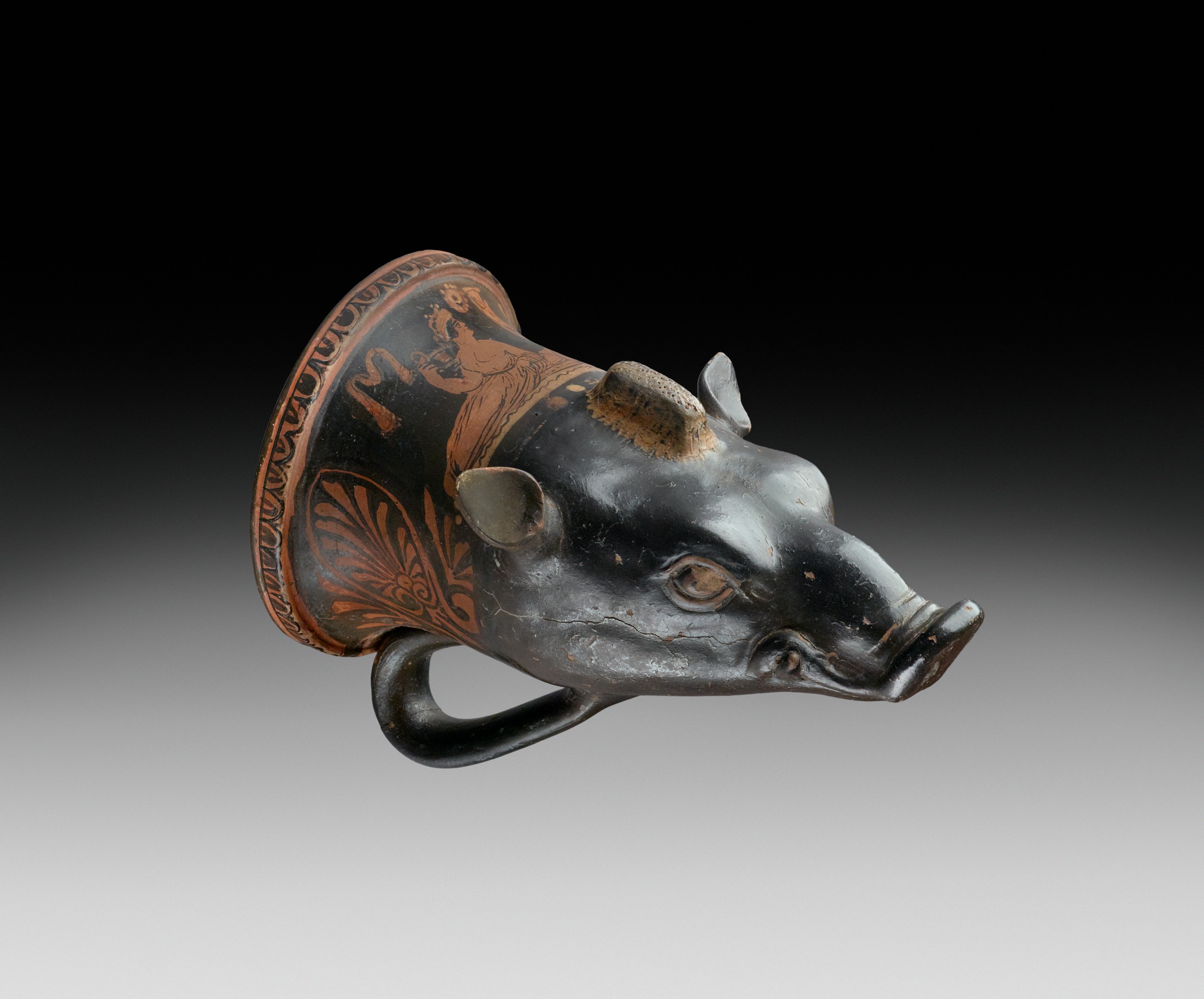
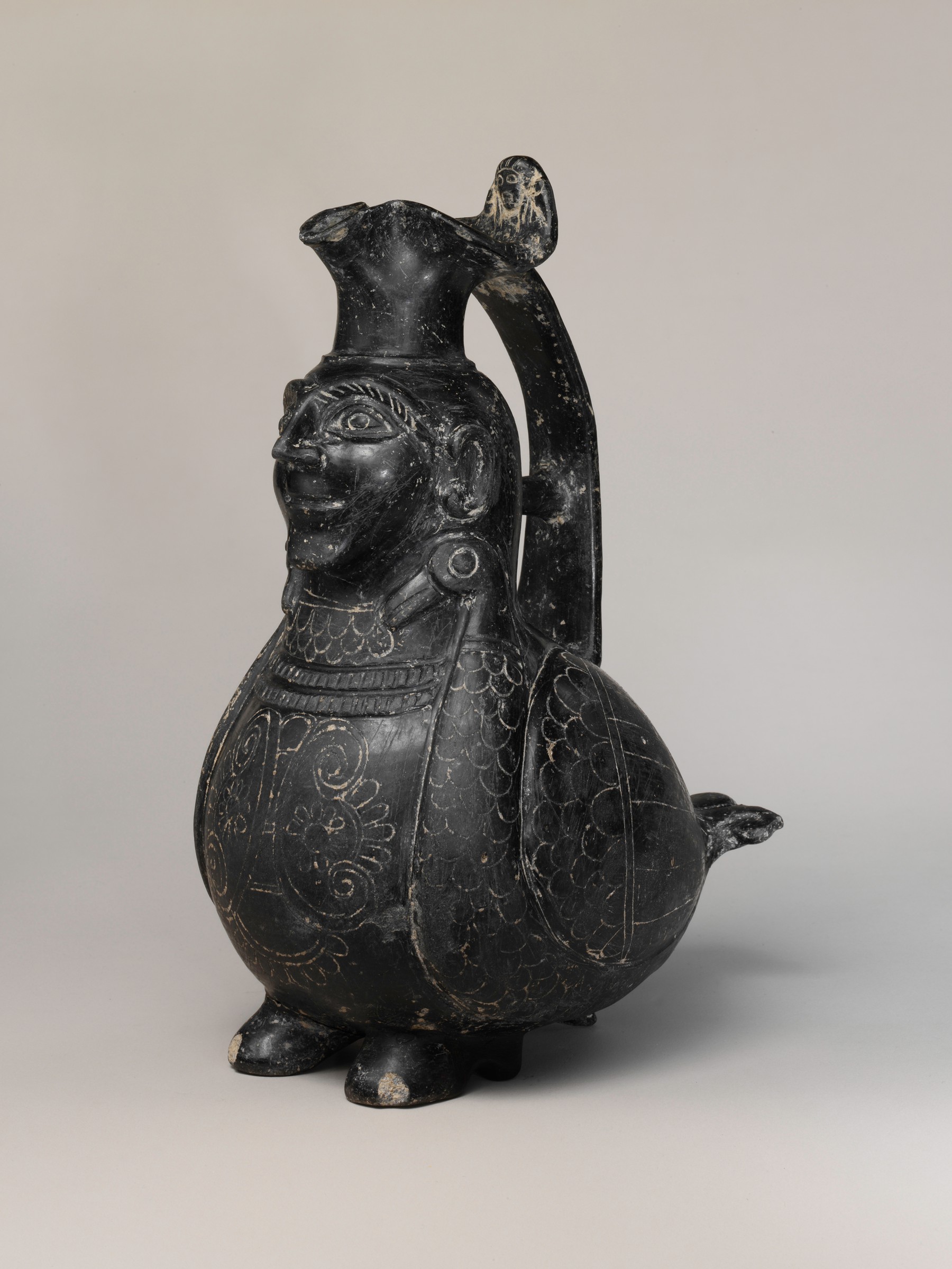
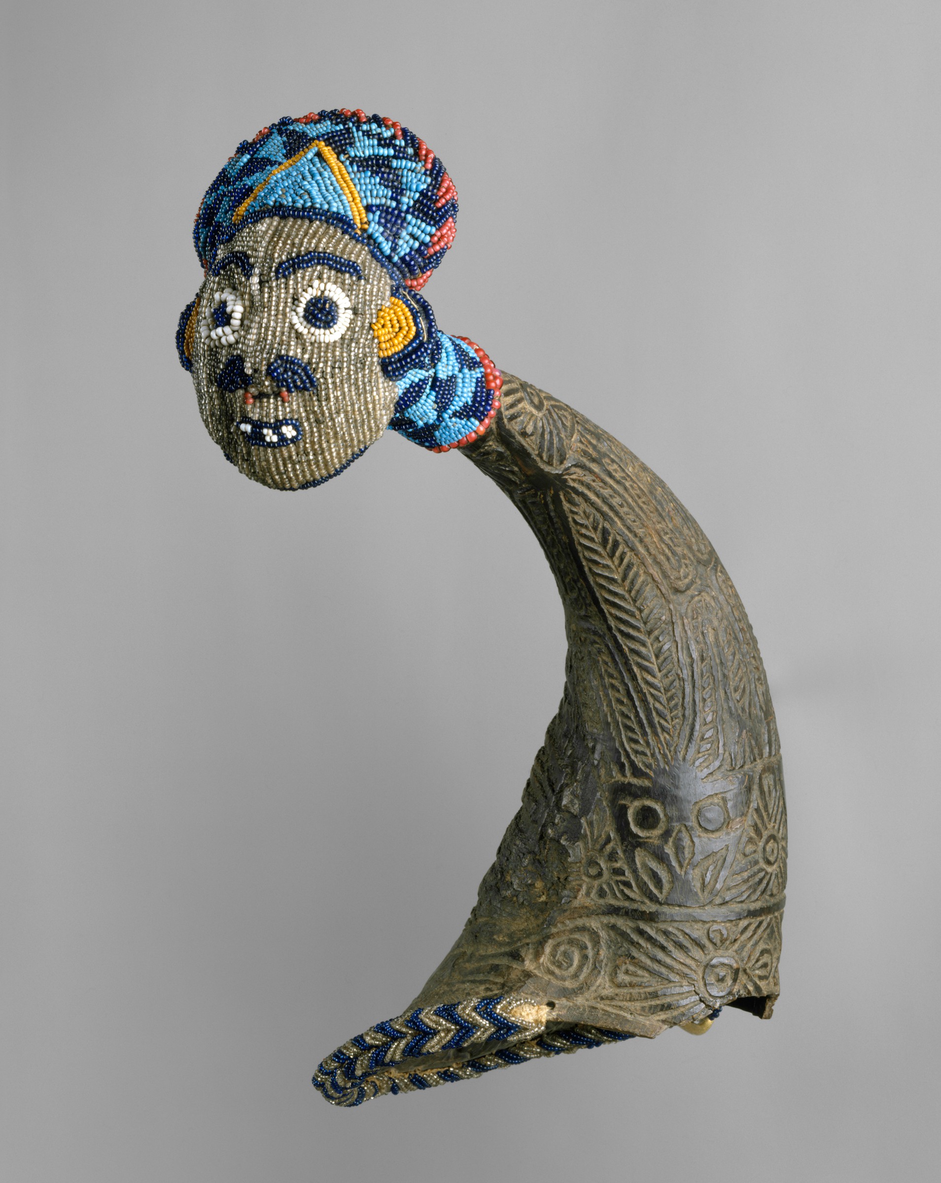
Animal-Shaped Vessels from the Ancient World: Feasting with Gods, Heroes, and Kings
Harvard Art Museums, Cambridge, MA
September 7, 2018 - January 6, 2019
Hey drink, drink, drink, everybody pour me another- Lil Jon, “Drink” from Party Animals
Nunc Est Bibendum (now is the time for drinking)- Horace, Odes
Never has the “party animal” been so at home in the world of art. Currently on view at the Harvard Art Museums, Animal-Shaped Vessels from the Ancient World: Feasting with Gods, Heroes, and Kings celebrates the conviviality and creativity of drinking containers. The exhibition, on view through January 6, 2019, displays seventy-five objects spanning four-thousand years. The vessels vary in terms of time period, geography, form, and material, but they all share a common function: as receptacles used for celebratory, ritualized drink.

Upon entering the exhibition, visitors are greeted with two vessels from two cultures: a sixth-century BCE Etruscan vase shaped like a siren and a fifth-century BCE bronze ritual vessel from China shaped like a duck (Figs. 1 and 2). Elsewhere in the gallery, two vitrines display a seventeenth-century gilded automata in the shape of a stag and a fifth-century BCE terracotta vessel with a crocodile side by side. The seeming disorder proves intentional and effective; by placing these objects within close proximity, the careful installation demonstrates the formal and material similarities across time and space: an interest in predators, mythological beasts, and horned creatures as favorites on drinking containers.
A closer look at these vessels brings their materiality into focus and showcases the creativity and skill of artists. The surface of a twentieth-century Cameroonian drinking horn features intricate, patterned carvings. The horn then tapers off into a three-dimensional beaded, figural head (Fig. 3). In other instances, such as an Athenian fifth-century BCE drinking mug in the shape of an eagle head, the artist decorated the exterior with a variety of patterns, from scale-like feathers, to delicate white lashes around the eyes, and a beak with purple, red, or white brushstrokes. The show also includes a small selection of other visual and material culture that contextualizes the ubiquity of drinking. In Lawrence Alma-Tadema’s Women of Amphissa, Greek women awaken in the marketplace after a night of carousing and celebrating the god of wine, Dionysus. A stone panel from a Qi dynasty funerary bed displays a scene where divinities feast and drink together in a world beyond the living.
Yet the greatest strength of this show is surprisingly not how drinking vessels relate to gods, heroes, and kings, but rather how they relate to humans doing very human things. From the gilded silver rhtyon (drinking horn) ostentatiously showing off the wealth of the fourth-century Achaemenid empire to the oldest object in the exhibition, an Assyrian bibru (drinking vessel) artfully molded into the shape of a leopard, animal vessels continuously reassert how humans used objects to connect themselves to one another through humor, skill, culture, and drink. As anthropologist Michael Dietler proposed in his opening lecture for the exhibition, the act of drinking represents an “embodied material culture” used by groups to cement very human ties and relationships.[1] Animal-Shaped Vessels uses objects to bind cultures, people, and places together with the inherently communal act of sharing a drink.
Alex Yen
Download Article
____________________
[1] Michael Dietler, “Liquid Material Culture: Anthropological Explorations of Alcohol and Drinking Vessels,” (lecture, Harvard Art Museums, Cambridge, MA, September 6, 2018).
Visual Essay

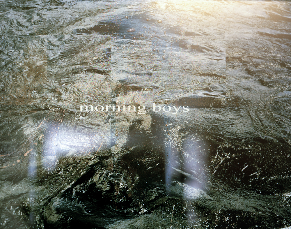


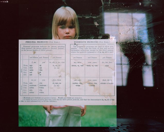


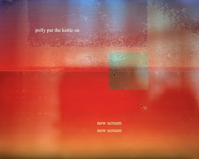

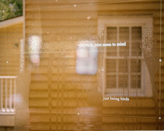

This body of work explores our relationship to images, especially with increasing technological access, and our current blindness to the photograph itself -- when images are forgotten as representations and mistaken for reality.
Using a large format camera, I photograph composed images, words, reflections, and grit, contained within my personal computer screen. The clearly visible surface of the screen redirects the viewer’s attention from what the photograph is representing (the subject) to the unintended and overlooked attributes of the medium—surfaces, context, and materiality. The proximity of image to text placed together on a screen mimics how we are accustomed to seeing words in relation to imagery in the everyday – media, advertisements, billboards, cell phones, laptops, and so on – and then disrupts it. Text and image become linked with uncertainty, creating a relationship between the two that is not caption nor definition nor reference; the ever growing, shifting, and changing screen, becomes static. In this, I attempt to de-familiarize our cultural atmosphere by exaggerating it, foiling it. By breaking apart and reassembling these systems of communication, my work makes visual the ambiguities of both image and text, and their material context to recognize the hidden process of individual interpretation in the reception of photographic and photo-textual information. All of these images are fragmented experiences of my life, reformed and manifested into a final image, but nevertheless their interpretation is not confined to that. Through this work, I hope to demonstrate the very conscious decisions we are able to make, when we truly pay attention, in constructing meaning from language and experience.
Julia Wilson
Frank Stella Unbound: Literature and Printmaking
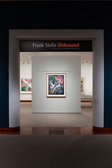
Born in Malden, Massachusetts, Frank Stella attended Phillips Academy, Andover, and continued his studies at Princeton University, in Princeton, New Jersey, earning degree in history in 1958. A painter, printmaker, and sculptor, Stella is one of the most accomplished and prolific artists working today, celebrated for his constant self-reinvention and fearless drive to push the assumed limits of abstraction.
Frank Stella Unbound: Literature and Printmaking (May 19 – September 23, 2018) was organized to commemorate the 60th anniversary of Stella’s graduation from Princeton. It is the first exhibition to focus exclusively on the fundamental role that published narratives played on the artist’s graphic oeuvre. Frank Stella Unbound explores a widely innovative period of Stella’s printmaking career, between 1984 and 1999, when he executed four consecutive print series — Illustrations after El Lissitzky’s Had Gadya (1984), Italian Folktales (1988-89), The Moby Dick Prints (1989-93), and Imaginary Places (1994-99) — each of which was named after a distinct literary work.
While serving as the intern in the Director’s Office at the Princeton University Art Museum during the summer of 2018, I had the opportunity to interview the exhibition’s co-curators, Mitra Abbaspour, Haskell Curator of Modern and Contemporary Art, and Calvin Brown, Associate Curator of Prints and Drawings. During our conversation on August 8, 2018, Mitra and Calvin discussed a number of important considerations in Stella’s work: the interplay of text and image, as it relates to Stella’s interdisciplinary approach and with regard to exhibition display and label copy; the artist’s working process and the incredible range of innovations he introduced to printmaking; the tension between pictorial and material surface texture; and, ultimately, the narrative potential of abstract forms.
Watch my full interview here:
Frank Stella Unbound: Literature and Printmaking is currently on view at the Museum of Contemporary Art Jacksonville (October 6, 2018 – January 13, 2019).
Althea Ruoppo interviews Mitra Abbaspour and Calvin Brown
Notes on Contributors
Sasha Goldman is a Ph.D. Candidate at Boston University. Her research focuses on Italian art and exhibition histories in the 20th and 21st centuries, with particular interests in artist-driven publications and exhibition catalogues, and temporary exhibitions and fairs. Her dissertation situates the artwork of Italian contemporary artist Maurizio Cattelan (b. 1960) in relation to the work of three seminal figures who are representative of major phases in recent Italian art, revealing how the shared strategies of Cattelan and his precursors demonstrate the fundamental role that history and national identity play in the work of Italian artists across the twentieth century.
Mariah Gruner is a Ph.D. candidate in American Studies at Boston University, where she has also earned a certificate in Women's and Gender Studies. She is currently working on her dissertation, titled "Stitching Selfhood, Materializing Gender: The Political Uses of Women's Decorative Needlework in the United States, 1820-1920." She also serves as the program coordinator for the Boston University Public Humanities Undergraduate Fellowship Program.
Anni Pullagura is a doctoral candidate in American Studies at Brown University. Her dissertation, “Seeing Feeling: The Work of Empathy in Exhibitionary Spaces,” explores the intersection of moral philosophy and visual culture in contemporary art and media. Currently, she is the Curatorial Fellow at the Institute of Contemporary Art, Boston.
Althea Ruoppo is a Ph.D. student studying modern and contemporary art in the Department of History of Art and Architecture at Boston University. Her research interests include postwar German art, trauma and the temporality and materiality of memory, and theories of repetition and reproduction.
Kate Sunderlin is a Ph.D. candidate at Virginia Commonwealth University currently writing her dissertation on the use of plaster in the nineteenth-century United States. She and her husband also own and operate the B. A. Sunderlin Bellfoundry in Ruther Glen, VA.
Julia Wilson is a photographic artist, who explores our relationship to, and the relationship between text and image, and photographic interpretation within contemporaneity. Using the large format view camera, Julia photographs images, words, reflections, and grit, composed on her personal computer screen. Julia received a Bachelor of Arts in Classical Studies with a concentration in Latin and Ancient Greek translation from the University of Virginia and recently received her Master of Fine Arts in photography at the Savannah College of Art and Design.
Alex Yen is a Ph.D. candidate at Boston University where she specializes in Roman art and archaeology. Her dissertation, “The Door Motif in Roman art: 100BCE-235CE” examines how Romans commonly represented and interpreted the image of the door across media as a symbol of physical and social mobility.
A Bodied Sound
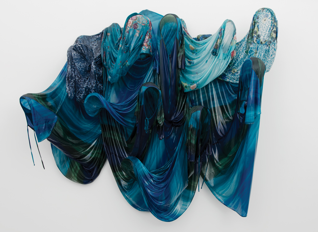
The body is a moving, singing thing. Every pulse, breath, beat unfolds with mechanical momentum, in a tempo set to the otherwise mundane activity of forward-moving life. Body sound, bodied sound: the pumping of blood, the intake of air, the movement of organs, the consuming of nourishment, and the expulsion of waste—this is the undercurrent for the differently- and multiply-abled alike, a form of life-listening composed predominantly of haptic sensibilities. Sound feels, because the body hears: it hears for what works, what fails, what disturbs, what leaves, what remains. But sound sees, too. Our vibrating matter is a visual as well as aural phenomenon, something intimated and visceral. As Fred Moten reminds us: “Sound gives us back the visuality that ocularcentricism had repressed.”[1] By tapping into the aesthetics of this shared haptic experience, Kevin Beasley’s aural sculptures shape themselves around exactly this sense of a bodied sound.
Stretched and dripped over yawning oval cores, Beasley’s hooded sculptures inscribe an ultimately soundless figure with a visualized anticipation of imminent sound. Beasley, who often works with acoustics and, even when he does not, thinks through the visuality of sound, builds these sculptural forms from housedresses acquired at the kind of corner fabric stores the women in his family and neighborhood would often visit to purchase readymade pieces or find fabrics to render their own. He soaks each found garment in resin and drapes them over Styrofoam mannequin heads affixed to microphone stands. As the resin hardens and the supports are removed, life-size ghosts emerge, curving elegantly and almost listlessly forward as they cling to the static force that suspends their tenuous weight. Something is arrested here, and something else is beginning to sound out.
Described variously as spectral and haunting, Beasley’s hooded sculptures entered his visual art practice on the heels of his ongoing sound-based works. Like an exercise in call-and-response, his installations have every appearance of possessing the vocal faculty Beasley demonstrates in his performances, in which he often remixes amateur recordings of conversations with family or friends alongside samples from recording artists or ambient noise from surrounding environments. His sound performances are laced with something not yet formed, as though containing within themselves a promised reward for close listening, while making any such opportunity nearly impossible. His sculptures, meanwhile, are open with another kind of tentative not-yet-there, gathered in a choral arrangement ready to sing but emptied of the possibility.
With or without the face, the body remains—or at least the threat of one. Visual culture studies scholar Tina Campt posits that everyday sound, the quotidian, is a “practice honed by the dispossessed in the struggle to create possibility within the constraints of everyday life.” [2] The dispossessed are not without sound; theirs is a sounding always present, ever gathered, continually pulsing. Perhaps moved to imagine what forms this dispossessed sound could take, Beasley began incorporating mixed sound into his hooded sculptures in the mid 2010s. In Phasing (Ebb) and Phasing (Flow), ambient gallery noise from adjoining rooms is picked up by hidden microphones and fed back to a receiving speaker situated before their respective work. The emitted sound is one in which the sculptures speak an assemblage of borrowed voices, of visitors idly passing, breathing, speaking by, of the background murmurings we are trained, by habit, to ignore. If not dispossessed, this is white noise made not meaningless but rhythmic, pulsing, vibrant, rehearsing over and over the sonic currents of the gallery space.
Channels are forged and re-forged in Beasley’s aural networks. Phasing (Ebb) is maybe even too channel-like, regurgitating the familiar into the unfamiliar, creating a loop both lyrical and menacing. This is a channeling different from other looped sculptural works Beasley has staged, such as Air Conditioner (Tempo), comprising the shell of an air conditioner set between a wall, only one half visible at any given time, while an audio track replays the dull, numbing ambient sound we rarely even notice. Therein is the trouble: background frequency is the lowly sound that should not register, but does, achingly. The quotidian is in fact full of noise; it opens new registers, or drags them, kicking and screaming, to the surface of our cognition. Sound, plainly speaking, is not to be dismissed but held, disrupted, dispersed, and claimed. Let us call this the “sounding” of being: “between bodies, in real time, in virtual time, in memory, in history, and across space.”[3]
If we ring ourselves into being, then we swallow the sounds that came before us and that will live somewhere, sometime, after us too. This is the kind of aural citation at work in Beasley’s 2014 performance at the Cozad-Bates House in Cleveland, Ohio. Entitled And in My Dream I Was Rolling on the Floor, in this work Beasley staged a four-part performance on a site once alleged to have been part of the Underground Railroad. Here, sound hinged on what Beasley imagined might once have been heard, and even still could be present, in the now condemned building, generating a sonic landscape suspended between times. It was this imprecise entanglement that first drew Beasley to traverse the visual and aural together. For Beasley, this exercise became “so much about observation and actually submitting to what is being projected, and that is a very vulnerable and revealing space to commit to, because you open yourself up to hearing something you may not understand, like, or agree with.”[4]
Agreement, especially the aural sense of it, is an odd thing to avoid. But noise, as David Novak reminds us, is disarming, distancing, and nauseating from its very phenomenological point of origin, “the Latin root of the word is nausea, from the Greek root naus for ship. The reference to seasickness captures the basic disorientation of the term: noise is a context of sensory experience, but also a moving subject of circulation, of sound and listening, that emerges in the process of navigating the world and its differences.”[5]
Becoming—aware, conscious, human—is sickeningly noisy. Beasley’s sculptural figures, in their own struggle to become, entice as much as they make us recoil. They speak on borrowed sound. Voraciously bright, they stretch their mouths out to reach us, leering and yearning, to bite vampirically into the breaths and words we utter before them.
And sometimes, we are the vultures. Bodied sound is circulatory, after all, and comes to rests, but never to ends. A sounding self is as much an ongoing encounter with what resounds as it is itself a process of becoming bodied, how phenomena consolidates into meaning. We register each other because—see, listen—“I sound better since you cut my throat.” [6]
Click here for more images of Beasley's work.
Anni Pullagura
____________________
[1]Fred Moten, In the Break: The Aesthetics of the Black Radical Tradition (Minneapolis and London: University of Minneapolis Press, 2003), 235.
[2] Tina Campt, Listening to Images (Durham and London: Duke University Press, 2017), 4.
[3] Gillian Siddall and Ellen Waterman, Negotiated Moments: Improvisation, Sound, and Subjectivity (Durham and London: Duke University Press, 2016), 2.
[4] Ruth Erickson, Kevin Beasley (Boston: The Institute of Contemporary Art/Boston, 2018), 65.
[5] David Novak, “Noise,” in Keywords in Sound, David Novak and Matt Sakakeeny, eds. (Durham and London: Duke University Press, 2015), 125.
[6] Fred Moten, “rock the party, fuck the smackdown,” Hughson’s Tavern (Providence: Leon Works, 2008).
Michelangelo: Divine Draftsman & Designer

Metropolitan Museum of Art, New York, NY
Nov 13, 2017 – Feb 12, 2018
The Metropolitan Museum of Art’s wide-ranging exhibition "Michelangelo: Divine Draftsman & Designer" examines the artistic production and development of the Renaissance master through his drawings. The exhibit is a result of the recent scholarly interest in drawings and their importance within the artistic process. The show spreads over twenty galleries and displays more than 200 works of art in diverse media: sculpture, paintings, architectural models, and drawings. On view are 133 drawings by Michelangelo, from fifty public and private collections in the United States and Europe, including studies of anatomy, preparatory sketches, as well as highly finished compositions. The exhibition celebrates Michelangelo as a disegnatore, draftsman, and demonstrates his extensive use of disegno, drawing, from his early days in Florence until his death in Rome.
The first gallery of the exhibition illuminates Michelangelo’s artistic background in the Florentine workshop of Domenico Ghirlandaio, a follower of the Florentine tradition of disegno, who explored diverse materials such as pen and ink, metal point, and black chalk. The exhibition demonstrates the themes Michelangelo explored in his drawings, particularly humanistic matters, as seen in Il Sogno, a presentation drawing meant to invoke intellectual debate (fig 1). Notable projects of Michelangelo are also featured; among them is the planning of the Tomb of Pope Julius II, who wished to have a grandiose tomb in St Peter’s Basilica.

While Michelangelo is known to have been a solitary person, curator Carmen Bambach revealed his engagement in artistic exchanges in the form of correspondence and his influence on other artists. Prominent in the exhibition is Michelangelo’s communication with Tommaso de’ Cavalieri, a Roman collector, who received Il Sogno and Cleopatra. The master also collaborated with other artists, such as Marcello Venusti, Daniele da Volterra, and Sebastiano del Piombo, who are included in the exhibit.

The main point of criticism concerning the curation of the exhibition is directed towards the gallery’s center which features preparatory drawings for the ceiling of the Sistine Chapel. The plethora of drawings demonstrates the painter’s artistic process and compositional planning. His artistic abilities and genius are also visible through the variety of materials, such as red and black chalks and ink. Hidden among the many drawings is the famed Studies for the Libyan Sibyl (fig 2). However, overshadowing these drawings, both literally and figuratively, is the digital projection of the famed ceiling in its completed state. Meant to situate the preparatory drawings within the greater context of their production, the digital projection, while novel in conception, unfortunately, served more as a visual distraction, divorcing drawings from the finished masterpiece (fig 3).
The renewed academic interest in Michelangelo’s drawings is shown to the public in this rich display of his oeuvre. Through his drawings, the exhibition effectively displays Michelangelo’s versatility as an artist as the works relate to all the artistic fields in which he was active. Beyond that, the exhibit shows him not as a solitary artist, but rather as one operating within a greater artistic network of patrons and artists.
Rebecca Arnheim
Takashi Murakami: Lineage of Eccentrics
Museum of Fine Arts, Boston, MA
October 18, 2017 – April 1, 2018
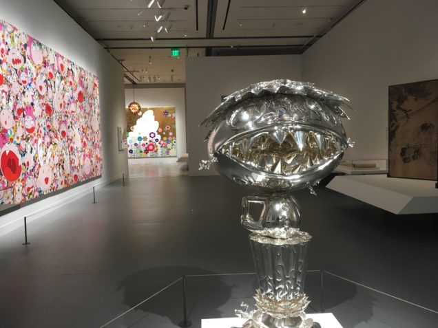
The Museum of Fine Arts, Boston’s exhibition Takashi Murakami: Lineage of Eccentrics, organized in collaboration with Japanese art historian Professor Nobuo Tsuji, combines the contemporary art of Takashi Murakami with that of the MFA’s permanent Japanese art collection. The exhibition attempts to place Murakami’s work within a long historical lineage of Japanese artists who strayed away from tradition. While the selection of over thirty of the MFA’s exemplary pieces of Japanese masterpieces is stunning, many of them are overshadowed by Murakami’s extravagantly large (and social media worthy) images.
The exhibition provides a plethora of examples of some of the finest works of Japanese art, and makes the argument that Murakami, if not a part of this “Lineage of Eccentrics,” has taken inspiration from them. Placed within the same narrative space to create this lineage, the permanent collection works are grouped together in six categories: Superflat, Animation, Kazari, Asobi, Religiosity, and Eccentricity. While these images are prominently displayed, some, such as the folding screens in the Kazari room, become overshadowed by the work of Murakami (fig. 1). Though these works are meant to show Murakami’s inclusion in this lineage, the exhibition on the whole privileges Murakami’s work allowing the historic pieces to get lost along the way. Noting this favoring, the exhibition remains humorous and enjoyable making the art on display accessible and intriguing to all.
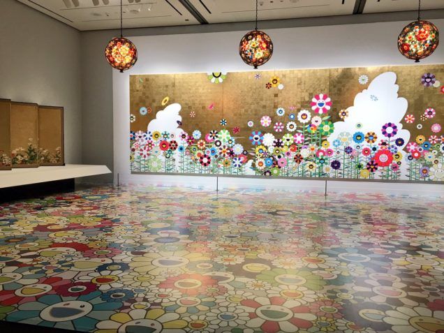
A highlight of the exhibition is the Kazari room which displays Murakami’s smiley face daisy mural Kawaii—Vacances: Summer Vacation in the Kingdom of the Golden with matching printed floor and light fixtures. Two brilliant folding screens from the MFA’s permanent collection frame the mural. These screens, Poppies(17th century, School of Tawaraya Sōtatsu) display floral scenes typical of seventeenth-century decorative art (fig. 2). On the wall leading to the room it is suggested that visitors take selfies and pictures with the work to prove they were here and to post on social media using the hashtag #mfaMurakami. Due to this and the monumental size of Murakami’s works, visitors largely ignore the screens and other surrounding works as they make their way towards a gift shop largely populated with expensive Murakami merchandise. The atmosphere of the exhibition then becomes less about lineage and more about Murakami, his work in relation to Japanese art, and the next great selfie.
Morgan Williamson