On Monday, October 27, 2025, the Initiative on Cities and the Metropolitan College City Planning & Urban Affairs Program co-hosted a discussion exploring the design and implementation of transit maps. This session of Transportation & The City featured Ken Dumas, Manager of the Central Transportation Planning Staff at the Boston MPO, and Mark Ovenden, broadcaster, transit map design expert, and author of Iconic Transit Maps: The World’s Best Designs. In a hybrid format, panelists shared their insights as map designers and engaged in a Q&A session with in-person and virtual audiences.
Broadcaster Mark Ovenden gained his first exposure to map design growing up in London, spending much of his childhood fascinated by the Tube map. His early passion for public transit inspired him to publish several books. Mapmakers employ geographic distortion, the practice of simplifying geographic representations to fit the space available. Ovenden credits Henry Beck, the designer of the first diagrammatic Tube map for the London Underground, as the inspiration for modern mapmaking. Drawing from Beck’s design principles, Ovenden’s work emphasizes a user-centered approach: “How can we design transit maps to best support ridership?” Ovenden looks to cities across the globe for answers.
Transit maps serve not only as a geographic representation of the city but as a functional diagram to help riders get from point A to point B. Cities have adapted transit maps to fit the natural landscape. For instance, Paris’s map depicts the River Seine as a natural boundary to orient riders within the city. The “flowmometer” design simplifies transit routes by depicting transit routes as colored lines, with circles representing each station. London’s “flowmometer” style inspired the New York City transit map, which later influenced Tokyo’s map. Cities have also experimented with various forms of visual representation. Some metro maps, such as the MBTA Commuter Rail map, are structured with radiating concentric circles. Examples from other cities, such as the heart-shaped transit map, showcase how designers use visual appeal to boost ridership. Ovenden pointed out the significance of the transit map as urban iconography: “If you do it right, you can create a map with iconic status.”
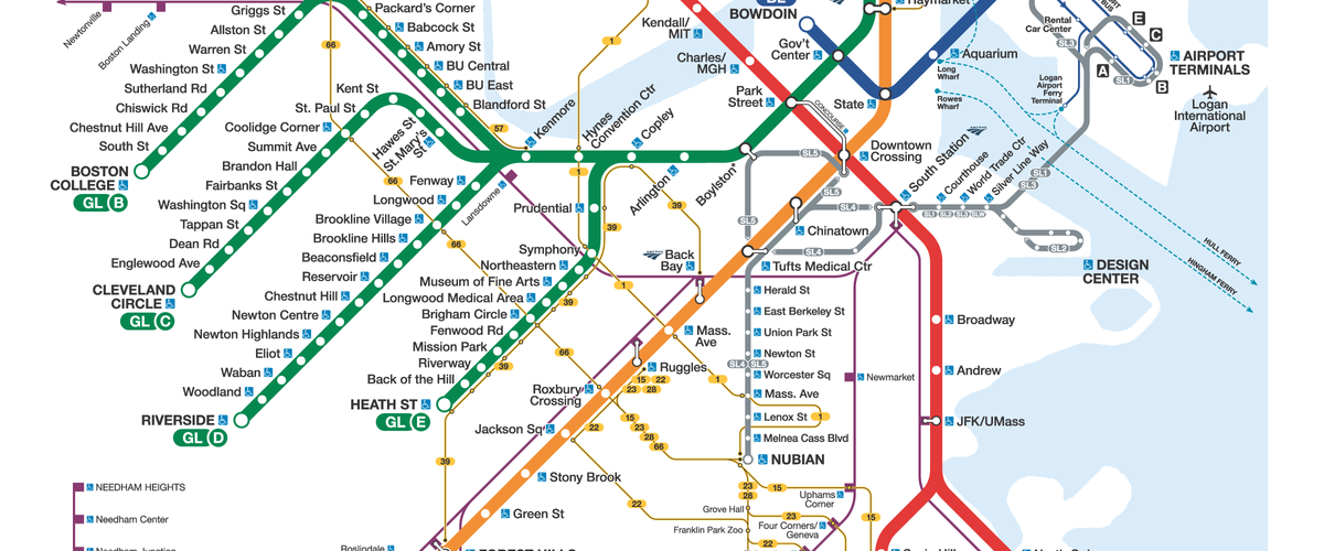
Reflecting on his career path from a film student to a professional designer, Dumas opened the discussion with an overview of the history of the MBTA transit map. In 1965, CambridgeSeven and Associates, a Boston-based architecture firm, developed the iconic MBTA design used widely today. The MBTA adapted the “Spider Map,” a design used from 1987 to 1995. To prioritize balance and symmetry, the “Spider Map” green line is placed in one corner to maintain compactness. In 1995, Dumas incorporated the newly established Orange Line as a southwest line: a symbolic representation of the Southwest Corridor, which stands at the site of the planned I-95 highway extension.
Previously, the Spider Map featured only accessible stops on the Green Line; the revised map reconfigured more spacing to accommodate station names. Boston’s transit map now represents all Green Line stops, promoting a sense of scale, place, and geography. The creation of the Green Line “pitchfork” highlights a key tension between realism and readability. With feedback from transit users, designers implemented a grid system to make the map easier on the eye.
The emergence of the Silver Line prompted mapmakers to revise Boston’s existing transit map. From 2006 to 2013, the MBTA gradually implemented key bus routes into the existing Spider Map. Both panelists highlighted the significance of the transit map as a city’s iconography. Landmark maps solidify the branding of the city. In 2013, the City of Boston hosted a public design competition for amateur map drawers to redesign the MBTA map. As Ken recalls, no professional cartographers participated because the city government was restricted from providing compensation.
Ken opened the Q&A session by describing how the transit map contributes to a city’s visual identity and establishes its brand: “Iconography all around us.” When designing a transit map for public use, it’s crucial to consider the trade-off between functionality and aesthetics. As Ken articulated, “All maps are diagrams; not all diagrams are maps.” In Paris, commuters orient themselves using a sense of direction and a strong sense of walking distance. Concerns about the overburdening of maps with information frequently arise in discussions of mapmaking spaces.
Mark described how many users are “mode-blind,” using a mix of transportation modes from bus, subway, ferry, and commuter rail. Ken has since phased out handwritten maps and now uses Adobe Illustrator to design “starting from one corner to the corner.” Supporting the city’s most extensive transit line, mapmakers consider public needs when imagining the future of the Green Line. In collaborative meetings with fellow map designers, Dumas has observed how map literacy is shifting. The solution? Dumas seeks to teach map-reading and to embrace new technologies.
Moving forward, Dumas sees the map “leading the system.” Pointing out key lessons to draw from Berlin’s transit map, Ken remarked how modern mapmakers are now “standing on the shoulders of giants.” Ken encourages aspiring mapmakers to draw inspiration from previous designs and ask, “How can we do that better?”