Visual Identity
The visuals that make BU, BU.
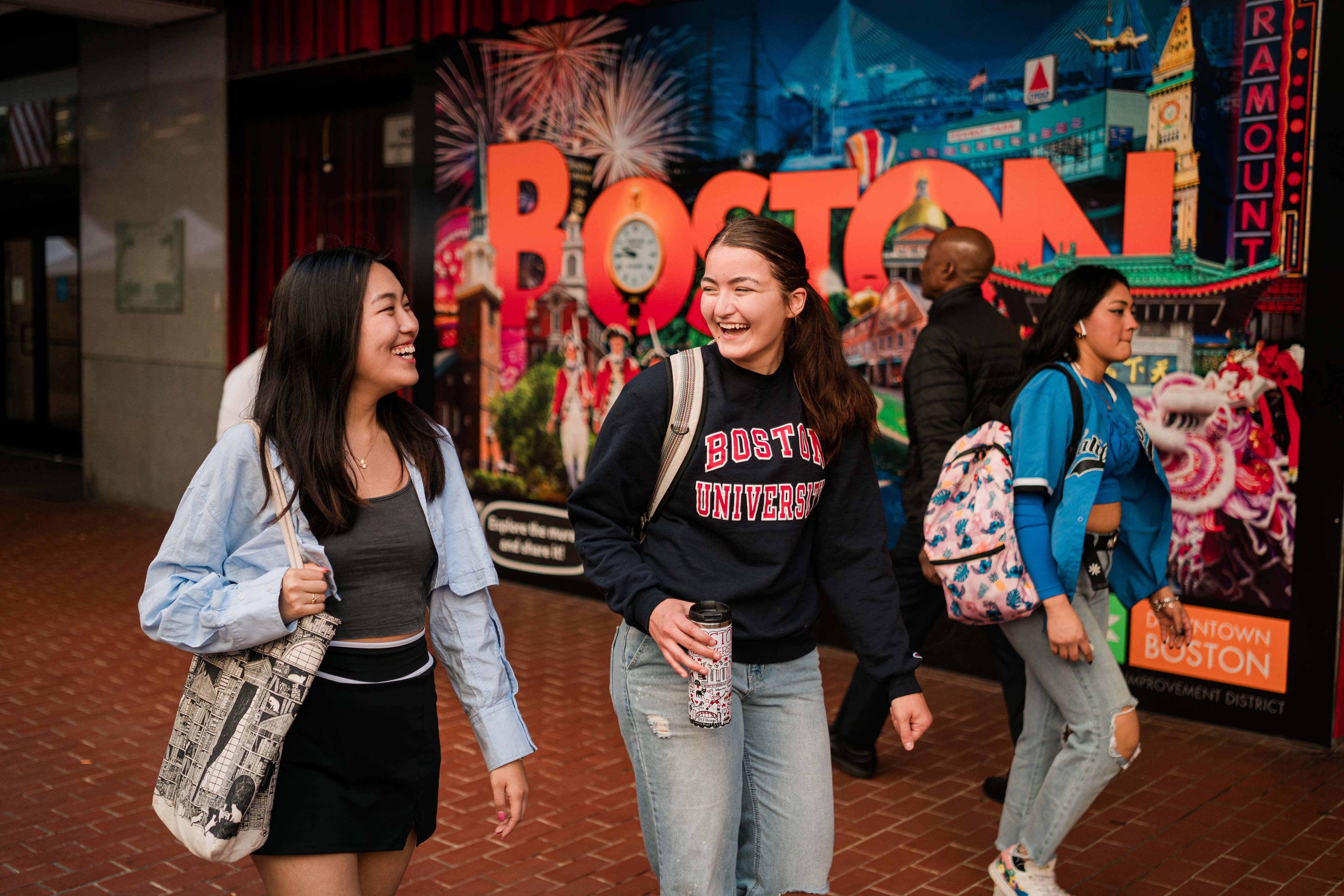
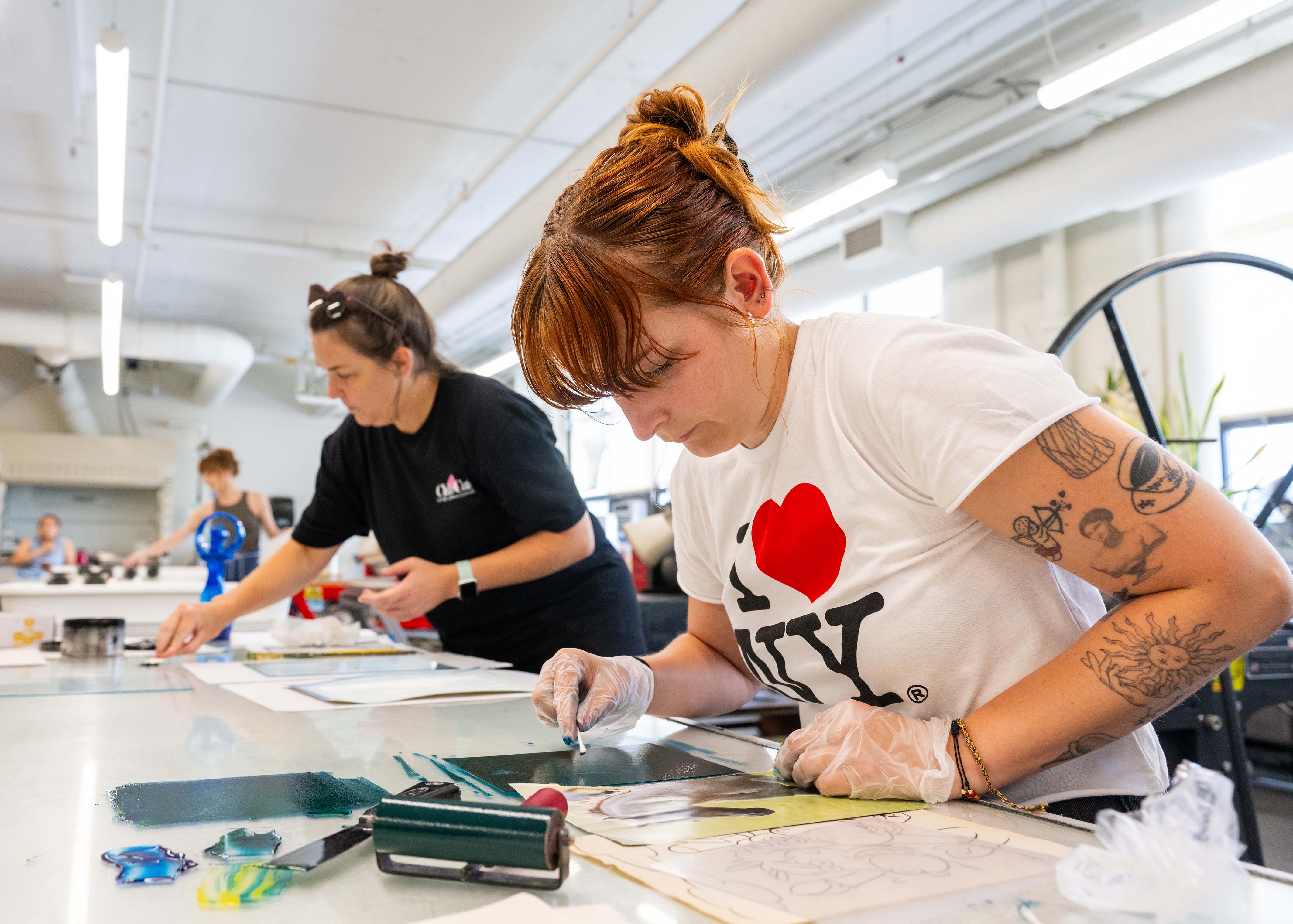




Putting words and visuals together well drives the BU Brand. Good design commands attention and elevates the message. It’s exciting, engaging, and unique. It’s what sets us apart.
Colors
Our primary colors are red and black. You are not required to use them when designing your communication material. But if you do, please use the color specifications below.
RGB – 204 0 0
CMYK – 0 100 75 4
HEX – CC0000
PMS – 186
RGB – 45 41 38
CMYK – 63 62 59 94
HEX – 2D2926
PMS – Pantone Black
Typography
Primary Typeface
While not required in every instance, Whitney is our University’s preferred font.
Whitney bridges the needs of editorial typography and public signage within a single design. Originally created for the Whitney Museum of American Art, its compact forms use space efficiently, and its ample contours and open shapes make it clearly visible under any circumstances.
Whitney Book

Whitney Semibold

Request Whitney
Whitney is available only to Boston University employees who are directly involved in the creation of marketing and communication materials.
Other Typefaces
Keep in mind that any typeface you choose needs to work in concert with design and brand, helping depict BU as a modern, confident, and dynamic university.
There are many fonts available, but generally we recommend:
- Clean and classic faces, with a preference for sans-serif fonts
- Other support fonts commonly used include Tiempos (serif), BentonSans, and BentonSans Condensed and Compressed (sans serif)
- Legible font sizing: 9–12 point for print body copy and 12–16 pixels for web body copy
- Use 14–16 pixels for long-form digital copy
- Avoid fonts that are overly stylized
- Limit using Boston University Red for text color in print. However, BU Red may be used for hyperlinks on web
- Avoid using type with drop shadows
- Avoid outlining type
- Avoid excessive condensing, tracking, horizontal scaling
Photography
When taking pictures or selecting images, try to represent what truly sets BU apart.
How to put the BU edge in pictures
Deliver on the story and concept. Tell the story, serve the story. Photography must do both. Images should be intrinsically interesting enough to pull in the viewer while delivering on a defined strategy, message, and concept. Photos in editorial pieces should intrigue while remaining truthful. Photos in marketing pieces can be more stylized, but all creative choices should be governed by the central idea.
Be resourceful. The proper technique is whatever the situation demands. BU is far-reaching, interconnected, diverse, and constantly evolving. This mandates flexibility and a range of techniques in how we express our brand to different audiences. Each photo must convey a specific attribute of our personality.
Execute at a high level. All photography must be worthy of our world-class institution. We tap different influences to enliven the brand and deliver the unexpected, making our work both approachable and aspirational.