
To me, communication is one of those things that’s so prevalent in our day-to-day lives that we forget just how important it is. We want to know what’s going on in the world around us, but there can often be a disconnect between those who have that information and those who want it. When we’re able to bridge these two sides together, it feels incredibly satisfying. Think about the last time you were filled in on some celebrity drama, read a clarifying news article on a world event, or discovered the attraction at the center of a large crowd gathering in the street. Working in communications feels like the bridge between the haves and have-nots, and it’s a position I enjoy.
Boston, being a city, always has something going on waiting to be discovered. As I uncovered more of the city’s rich history and culture, I became interested in urbanism. Encouraged by my time at the Urbanism Club at BU (or the BUrbanists), I became increasingly involved in local politics. I’d represent the club and bring a student perspective to public meetings on housing, infrastructure, pedestrian/bike safety, etc. This led me to wonder what it was like on the other side: instead of being a student advocate on the outside, what was it like to be a City of Boston employee on the inside who interacts with residents of the city like me? I wanted to have that experience, so I immediately applied when I discovered the IOC was hosting a communications internship in the City of Boston’s Office of Climate Resilience (OCR). It seemed like the perfect opportunity to bridge my interest in communications and my work in student advocacy.
For some context, the OCR is a relatively small and young department. Just a few years ago, it was known as the Climate Ready Boston team. Therefore, my main goal during the internship was to assist them in developing evergreen, printable assets (such as flyers) that would help the public learn more about the team’s work. In this reflection, I’ll discuss the two main projects that I worked on during my time.
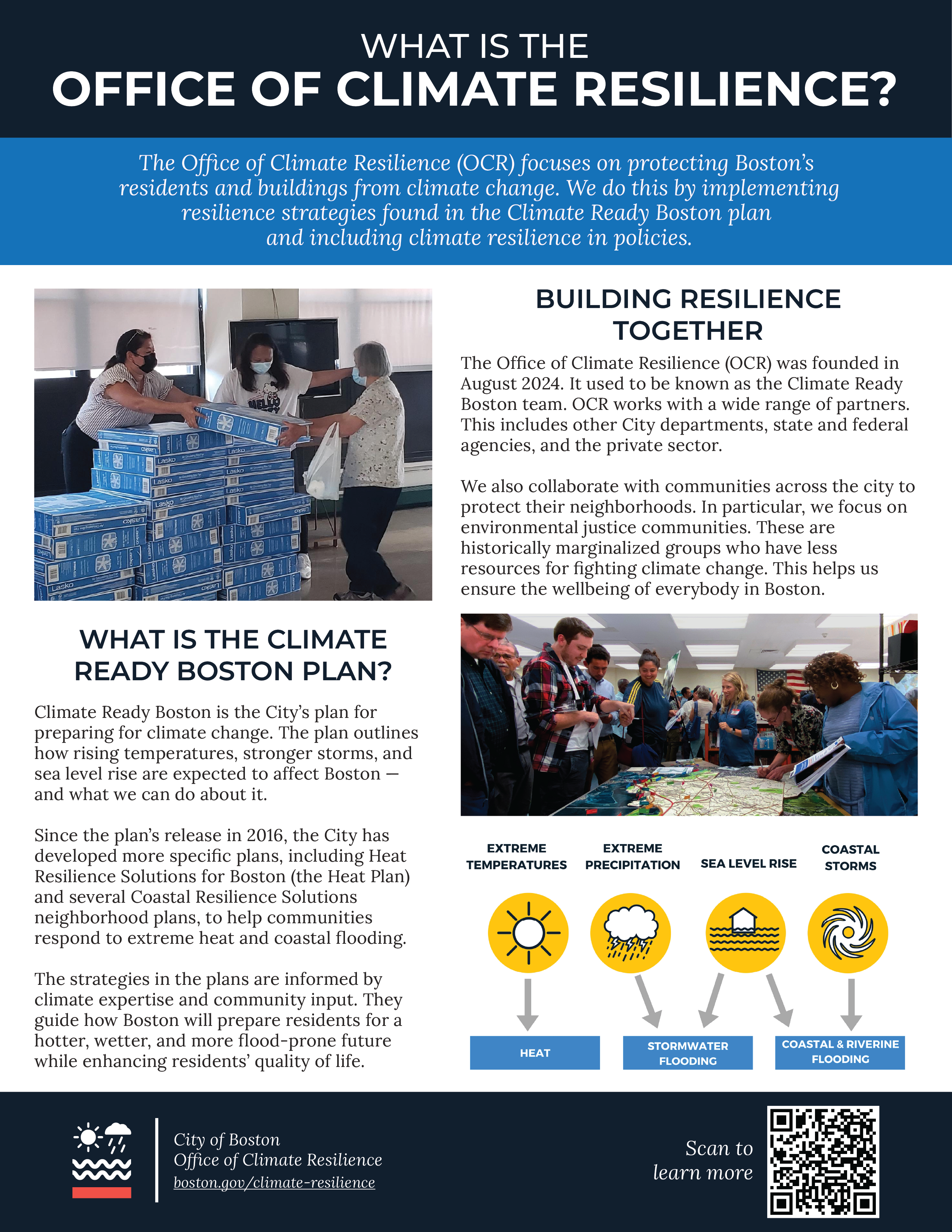

The first project was a one-pager explaining what the OCR does and what projects they’re working on. This turned out to be deceptively simple for one main reason. While other city departments have relatively straightforward names – the Office of Transportation is in charge of transportation, the Disabilities Commission works on issues affecting Boston’s disabled community – the term “climate resilience” is less well known and requires a bit of an explanation. Part of the City of Boston’s brand guidelines state that written content has to stick to a 9th-grade reading level. However, many terms used in environmental science are categorized much higher than 9th grade, making defining “climate resilience” difficult.
After many attempts to come up with a straightforward definition for climate resilience, it turned out that the answer was simple. Just don’t define it. Instead, with the feedback and support of the rest of the OCR team, I decided to focus on what the department actually does. This, in turn, implicitly defined climate resilience as the issues that the OCR worked on. More importantly, it allowed us to dedicate what little space we had on a flyer to the real, tangible efforts that the OCR was making to protect Boston from climate change. Therefore, I added a blue mission statement under the title that provided an overview for both the OCR and climate resilience simultaneously.
Maximizing information while minimizing space and complexity became the key theme of my time at the OCR. On the back side of the one-pager, the OCR wanted to show off many of their projects. When I met with the team to discuss what projects should be added, it turned out to be a massive list. Each project also contained tons of little details that would greatly improve the quality of life for Boston residents nearby, but there was not enough space. I had to pick out the bits that would be the most beneficial to the average Boston resident to learn. For instance, I made sure to emphasize general improvements to shorelines or new amenities open to all. In the end, I had to trim down the many great coastal projects into one or two sentences so they could fit with room to spare on the map.
This was one of the toughest parts of the internship for me. The people who work in the OCR (and the City’s many other departments) are so deeply passionate about their work that removing information on a design felt like I was disrespecting their efforts. There was one way to remedy this, and it was through visual, rather than written communication. This is best exemplified in my second major project.

The OCR wanted an activity to keep children busy and educated at their tabling events, so my second project was a coloring and activity book. Because my target audience was children, I didn’t feel like I could dance around defining terms like I did for the one-pager. Straightforward definitions, I decided, would be the easiest way for kids to grasp these topics. I wouldn’t have a lot of space for words; however, the coloring book is primarily for, well, coloring. At most, I would be able to squeeze out two or three sentences (again, the theme of min-maxing space and information). Therefore, it made sense to have my hand-drawn illustrations support or supplement the written material.
Take the page below, for instance. On the left-hand side, I made sure to draw concrete examples to support the written advice: trees provide good outdoor shade, and public libraries are very accessible sources of indoor shade. It also helps that it’s fun to color in many books in different colors. On the right, I thought it would be best to provide an example for a vague term like “green infrastructure”, so I chose a rain garden for two reasons. One: they’re easy to define. Two (and most importantly): they’re fun to color. This rain garden is another example of implicit design. Rain gardens and green infrastructure in general have a secondary purpose of supporting native pollinator species. This is a fun factoid, but I didn’t have the space to include it. Therefore, I drew many bugs and pollinators hanging around the flowers to suggest it implicitly. Adding little illustration “easter eggs” was one of the best parts of this project. The OCR team and I did a little coloring on my last day, and it was so rewarding to see them discover all the little details I added!

I also worked on a few other small-scale projects after these two, such as an indoor cooling guide for Boston residents. The work went by faster after I got better at the art form known as “cramming as much information into an 8.5 by 11-inch sheet of printer paper in an aesthetic manner”. Through the short 8 weeks, I felt like I improved my communication and graphic design skills tremendously. When there’s so much important information and so little space, it really forces you to get creative with the ways you write and arrange text. I’ve gained a deeper understanding and respect for the selfless work done by city workers on a daily basis. I feel honored that I had this opportunity to uplift them by increasing public awareness for the projects, initiatives, and efforts that they put into bettering Boston for all of us.