This section of the Project LITE web site contains images that illustrate a variety
of visual phenomena. They were created in
Adobe Illustrator and then saved for posting as PDFs. These files can be downloaded and printed at any scale and still retain the sharp
edges which facilitate the efficacy of most of the effects. All of these phenomena require or gain strength from being displayed in a
large format, say a yard (or meter) on a side. If the user has access to a poster size printer, it is recommended that the figures be
printed at that scale. About the choice of specific images: we have selected ones that exemplify a broad range of visual phenomena.
They are based on images originally created by artists, vision scientists – or by people who could, in fact, be called both. The PDFs
we have posted are our own variations on these works and are not by the artists themselves. A few references – either by the artists or
scientists who created the individual images or that contain discussions about their works – are included below. In each group, hitting
the “PDF” button can download a single file containing all the PDFs in that group. The button labeled “Zip” will download a folder
containing the individual files in that group.
|
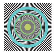
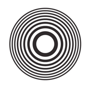
Isia Leviant’s “Enigma”The French artist Isa Leviant created the original version - in 1980 - of the figures that we have included. By placing colored circular “avenues” around arrays of radial lines, he noticed that the avenues appeared to contain “blobs” that sometimes move clockwise, sometimes counter-clockwise. He called the figure “Enigma”. It gives rise to what is now sometimes called the “traffic illusion”. He originally called it the L (for live) effect. It does work at small scale, but we have produced it for printing on a large scale, say meter size, just as his original prints were done. The cause of the effect has given rise to a small industry of experiments and explanations. We include here the two original references by the artist. |
||

|

|

|
Leviant, Isia, “Illusory Motion Within Still Pictures: The L-Effect”, Leonardo, 15, No. 3, 22-223, 1982. Leviant, I. “Does ‘Brain Power’ Make Enigma Spin?”, Proc. Roy. Soc. Lond B, 263, 997 – 1001,1996. |
| Download PDF | ZIP | |||
|
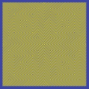
Reginald Neal’s “Square of Two”Our image is based on a lithograph printed on paper called “Square of Two” created by the American artist Reginald H. Neal in 1970. That work was approximately 23 inches on a side and was done with two colors: blue lines on a yellow background. It produces effects sometimes referred to as “jazzing” or “flicker”. This work was in turn based on an earlier work by Neal entitled “Square of Three: Yellow and Black” which consisted of an array of 9 squares and was approximately 33 inches on a side. That work was created using lithographic ink and acrylic paint on canvas, which was mounted on Masonite. We have included versions of “Square of Two” in various color combinations to allow observers to explore several visual effects including isoluminence. |
||

|

|

|
Kupin, J. J., Haddad, G.M. and Steinman, R. M., “Saccades in Neal’s “Square of Three”,
Perception and Psychophysics, 14, No. 2, 298 – 300, 1973. Reginald Neal: A Retrospective of His Prints, catalogue of an exhibition at The Jane Voorhees Zimmerli Art Museum, Rutgers, the State University of New Jersey, 1986. Inglis, T. C. and Kaplan, C. S., “Generating Op Art Lines”, in Computational Aesthetics in Graphics, Visualization and Imaging, 2011. |
| Download PDF | ZIP | |||
|
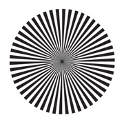
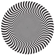
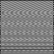
Donald MacKay’s “Rays”In a series of papers published in the journal Nature beginning in 1957, the British vision scientist Donald M. Mackay displayed a number of stationary patterns that in many observers give rise to the percept of both motion and color. These simple patterns consisted of linear arrays of parallel lines, as well as arrays of radial lines, of various numbers and relative line thicknesses. These figures can be quite effective even viewed on a small scale. They gain strength when printed on a large scale and viewed in bright light. We have produced such patterns with a variety of parameters. |
||

|

|

|
Mackay, D. M., “Moving Images Produced by regular Stationary Patters, Nature, 180,
849 – 850, 1957. Gregory, R. L., “A Comment: Mackay Rays Shimmer Due to Accommodation Changes”, Proc. Roy. Soc. Lond. B, 253, 123, 1993. Note: Some of these effects can be explored on the Project LITE web site. |
| Download PDF | ZIP | |||
|
Nicholas Wade’s “Chrysanthemum”Nicholas Wade is a vision scientist at the University of Dundee in Scotland. He has carried out psychophysical research on many visual phenomena
and has written extensively on the history of the neurosciences. He is also an accomplished artist. The figure we have included here is a vectorized
version we created in Adobe Illustrator based on one of the art works that Wade himself drew by hand. It is included here because it elicits a feeling of
depth in many observers. Viewed by closing one eye, or monocularly through a tube, or using a device called a “synopter” that allows for viewing the same
image with both eyes (without disparity) the image gains even more in depth. |
||

|

|

|
Wade, N., The Art and Science of Visual Illusions, (Routledge & Kegan Paul, London), 1982. Wade, N., Visual Allusions: Picture of Perception, (L. Erlbaum Associates, London), 1990. |
| Download PDF | ZIP | |||
|
Bridget Riley’s “Fall”The painting “Fall” by the British artist Bridget Riley is one of the iconic images of the “Op Art” movement of the 1960’s. It is in the Tate Gallery in London. Painted in black and white, it is quite large, measuring approximately 56 inches on a side. For many viewers, it has a disorienting effect giving rise to percepts of both depth and motion. There is a large literature of the possible causes of these effects. Two recent articles that include many references to the literature are included here. |
van Tonder, G. J., “Perceptual Disruption and Composure in Bridget Riley’s Zanker, J. M., Hermens, F. and Walker, R., “Quantifying and Modeling the Strength of Motion Illusions Perceived in Static Patterns”, Journal of Vision, 10, No. 2, 1 – 14, 2010. |
|
| Download PDF | |||

|
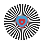
Marcel Duchamp’s “Fluttering Heart”The image presented here is based on one created by the artist Marcel Duchamp. Between 1936 and 1961, he produced several versions of what he called “Coeur Volant” as silkscreen prints on paper. That image was, in turn, based on ideas discussed by Herman von Helmholtz in his book on physiological optics. He noted that by placing a red image of a smaller size on a background of blue – or vice versa – and by moving the image laterally in front of an observer, the smaller image would appear to “slip” with respect to the larger. The red and blue have to be quite saturated and, for the strongest effect, widely separated in color space. Under the right circumstances, an apparent “detachment” or “jittering” of the figures can be seen just by gazing at the static image. Marcel Duchamp made particularly effective versions of the effect. |
||

|

|

|
Duchamp, M., Cover, Cahiers D’Art, 1936. Von Helmholtz, H., Treatise on Physiological Optics (Dover, New York), 1962. English translation by J. P. C. Southall for the Optical Society of America from the 3rd German edition of Handbuch der Physiologischen Optik, (Voss, Hamburg), 1910. Nguyen-Tri, D. and Faubert, J, “The Fluttering Heart Illusion: A New Hypothesis”, Perception, 32, 627 – 634, 2003. Note: An interactive version of the Fluttering Heart effect can be explored on the Project LITE web site. |
| Download PDF | ZIP | |||
|
Agustin-Jean Fresnel’s “Zone Plate”The images included here are of the pattern called a Fresnel “zone plate”. The figure
consists of alternating black and white rings of (roughly) equal areas. The configuration was originally devised by the
French physicist Augustin-Jean Fresnel around 1819. It finds its main application in photography and imaging. Reduced in
size with alternating opaque and transparent regions, it can be used in place of a lens or pinhole to produce quite intriguing
photographic images. It is included because of its novel appearance and because in the large format presented here, it can give
rise to the percept of subjective colors in many observers, mainly between the outer rings.
|
||

|

|

|
Fresnel, A., “Memoir on the Diffraction of Light”, in The Wave Theory of Light – Memoirs by
Huygens, Young and Fresnel, (American Book Company, New York), 79 – 145, 1900. |
| Download PDF | ZIP | |||

|
Linear Grid Line PatternsWe have included several images consisting of parallel straight lines. This is the simplest arrangement of lines that
gives rise to so-called “subjective” colors. British scientist David Brewster first reported the effect in 1825. The effect has been “re-discovered” many
times since. Printed on any scale and viewed from the appropriate distance, many observers report the appearance of regions of de-saturated colors. This
static pattern can be viewed either with a vertical or horizontal orientation or rotated by 45 degrees to the vertical. The origin of the colors perceived
in both stationary and moving black and white patters is still open to debate. |
||

|

|

|
Brewster, D., “On Some Remarkable Affections of the Retina, As Exhibited in its Intensity to Indirect
Impressions, and to the Impressions of Attenuated Light”, Edin. J. Sci., 3, 288 – 293, 1825. Erb, M. B. and Dallenbach, K. M. “’Subjective’ Colors from Line Patterns”, Amer. J. Psychol., 52, 227 – 241, 1939. |
|
Download PDF | ZIP 36” x 72” |
|||
|
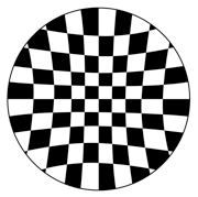
Hermann Helmholtz’ Hyperbolic CheckerboardThe images contained here are based on the patterns first discussed by the 19th century polymath
Hermann von Helmholtz in his great work on physiological optics. In it, he included a small image of a checkerboard pattern with the
lines distorted – most noticeably in the periphery - to form a kind of hyperbolic checkerboard. In the original book, the image is too
small to really use as a test target. However, he noted that if it were enlarged and viewed from a suitable distance that the lines in
the periphery would appear to “straighten out”. Expanded to 36 inches on a side and viewed from a distance of about 18 inches, the effect
is quite striking. The percept suggests that there is a complex mapping of physical space to visual space, particularly in the peripheral
parts of the visual field. We have included an image of a regular checkerboard as well. This figure, on the other hand, does not appear
to become curved with near viewing. However, while approaching it rapidly, the regular checkerboard does appear to bow out and look
convex. |
|

|

|
von Helmholtz, H., Treatise on Physiological Optics (Dover, New York), 1962.
English translation by J. P. C. Southall for the Optical Society of America from the 3rd German edition of Handbuch
der Physiologischen Optik, (Voss, Hamburg), 1910. Rogers, B. and Brecher, K. “Straight Lines, ‘Uncurved Lines’ and Helmholtz’s ‘Great Circles on the Celestial Sphere’”, Perception, 36, 1275 -1289, 2007. |
| Download PDF | ZIP | ||
|
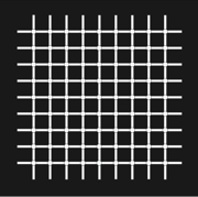
“Scintillating Grid” EffectThe “scintillating grid” illusion is a recent variation of the “Hermann Grid” illusion that was originally reported by Ludimar
Hermann in 1879. In both cases, viewers report seeing the appearance of “blobs” at the intersections of the avenues cutting through
the background field. If one stares at a given dot, it usually disappears, though the ones in the periphery remain. This effect works
on any scale, but is particularly effective with a large image.
|
|

|

|
Schrauf, M., Lingelbach, R. and Wist, E. R., “The Scintillating Grid Illusion”,
Vision Research, 37, No. 8, 1033 – 1038, 1997. Note: Controllable versions of this effect can be explored on the Project LITE web site. |
| Download PDF | ZIP | ||

|
Based on the Ouchi IllusionThe image presented here is a variation of the one that appeared in a book by the Japanese artist Hajime Ouchi. The book contained “746 designs for artists and craftsman”. Motion of the observer, or of the image, gives rise to the appearance of a slippage of the central region with respect to the surround. A wide variety of experimental and theoretical studies of this image have been carried out in the short time since its construction.Ouchi, H., Japanese Optical and Geometrical Art, 75, (Dover, New York), 1977. Fermuller, C., Pless, R., Aloimonos, Y., “The Ouchi Illusion as an Artefact of Biased Flow Information”, Vision Res., 40, 77 – 96, 2000. |
| Download PDF | |
Miscellaneous Images |
||
|
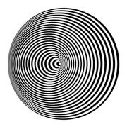
We include here three other images that give rise to novel percepts in most observers. The black and white
circular image on the left is based on several paintings and graphics by Italian artist Marina Apollonio. This two dimensional picture
produces a strong impression of depth. The red and blue figure is based on the 1966 screen print “Looking Glass No. 3” by British artist
Peter Sedgley. In this case the blurring of the edges of the circle combines with the red/blue contrast of colors in the image to make it
difficult to get a firm visual grip on the central circle. The final image is called “Fluttering Rays” and was designed by the French/American
artist Rrose Sélavy. |
||
|

|
|
| Marina Apollonio | Peter Sedgley | Rrose Sélavy |
| Download PDF | Download PDF | Download PDF |
The PDFs included here are by Kenneth Brecher and Rebecca Puno.
Project LITE is supported by NSF Grant # DUE-0715975.
© 2012 Trustees of Boston University.